Client Success Stories

Real Businesses. Real Results.

From Coimbatore manufacturers and coir exporters to hospitals, schools, hotels, churches and online stores, see how we built websites that bring in measurable business. Filter by sector, then read the challenge, what we did and the results.

56 detailed case studiesFilter by sectorLive websites you can visit
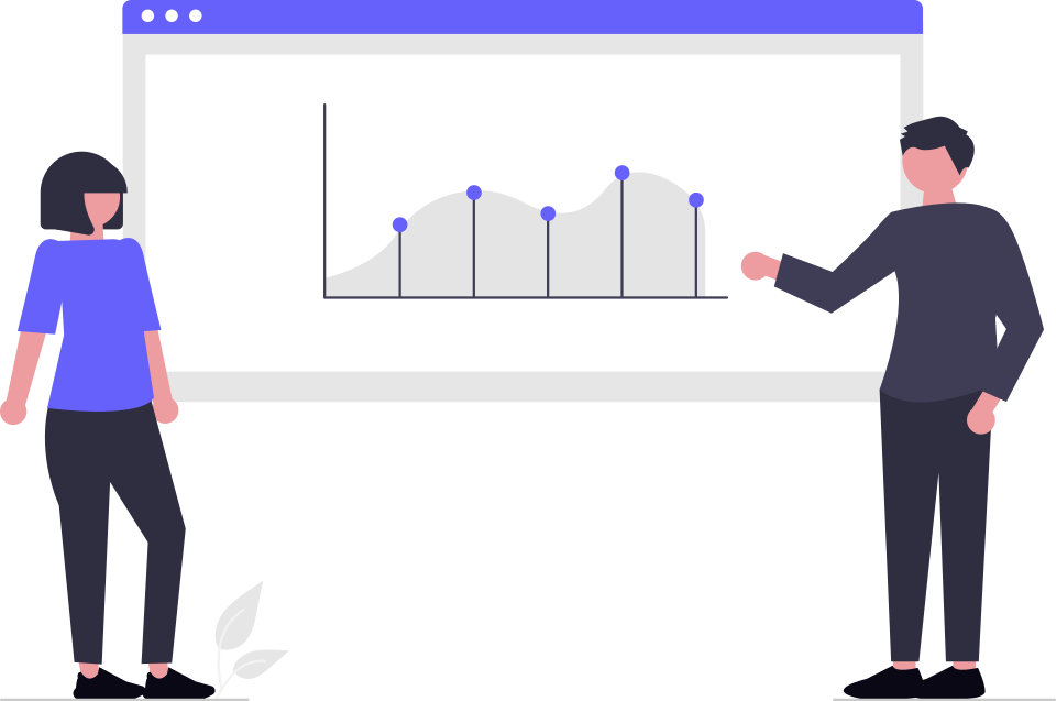
Growth chart showing business results
6xInternational enquiries
5xAppointment bookings
3xOrganic traffic — Salzer Group
4xOnline enquiries — Kaycee
5xBookings — KR Hospital
6xExport enquiries — Vishal
Featured Client Case Studies

How We Solved Real Business Problems

Pick a sector to see the projects that match yours. Each case study shows the problem the client faced, what we built and the results.

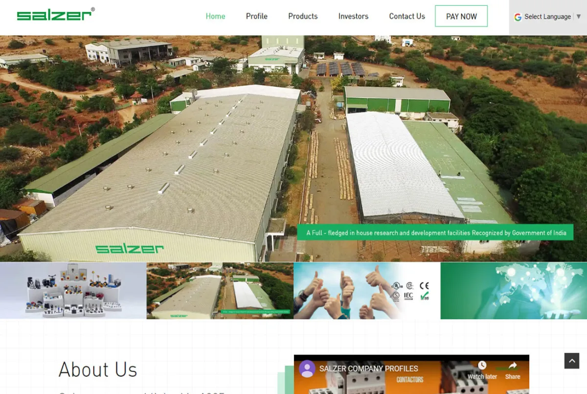
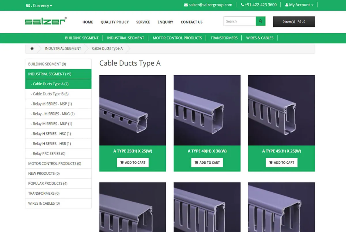
Salzer Group website
3xOrganic traffic
Top 5Google rankings
60%More enquiries
100%Mobile ready
Electrical ManufacturingCorporate WebsiteProduct CatalogueInvestor RelationsSEOCMS

Salzer Group — A Digital Home for a Four-Segment Electrical Manufacturing Group

The Challenge

  • Dozens of product families sat across four business segments with no navigable structure.
  • A panel builder chasing a switch rating and a homeowner browsing modular switches landed on the same page.
  • Investors could not easily find results, annual reports, shareholding patterns and governance filings.
  • Export buyers wanted to see the five plants, tool room, testing laboratory and approvals, not product photos alone.
  • Engineers and dealers search from the shop floor, so mobile had to come first.

What We Did

  • We designed a clean industrial visual system and a homepage that introduces the four segments early, so visitors self-select.
  • We built a mega menu that mirrors the business and gave every product family its own page and clean URL.
  • We published catalogues, price lists and brochures beside the products they describe.
  • We wrote Profile, Approval and Industries sections covering the German collaboration, R&D recognition and CE, UL, CSA, VDE and RoHS marks.
  • We structured an Investors section for results, annual reports, filings and notices, grouped by type and year.
  • We separated corporate enquiries from the Salzer online store and handed over content management to the Salzer team.

Built With

PHPMySQLBootstrapMega Menu CatalogueInvestor Document LibraryGoogle AnalyticsSchema Markup
“Samantha Technologies completely transformed our digital presence. The new website perfectly represents our brand scale and the SEO work brings significant new distributor inquiries every month. Truly professional.”— Marketing Manager, Salzer Group
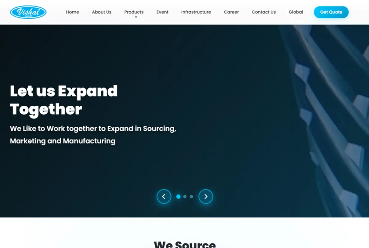
Vishal Precision GmbH website
3Product pillars
6Brand lines represented
6Named team profiles
100%Mobile ready
Precision EngineeringExport WebsiteMulti-Brand CatalogueQuote SystemInternational SEO

Vishal Precision GmbH — Taking an Indian Precision Manufacturer into the European Market

The Challenge

  • A German company selling Indian precision manufacturing had to earn the trust of European tooling buyers.
  • The three-pillar model, We Source, We Market and We Manufacture, would be lost in one flat product list.
  • Represented brands such as Shiballoy, AMT and Elotech needed their own identity and technical detail.
  • Mould base buyers judge dimensional envelope and lead time, so specifications could not hide behind a brochure request.
  • Enquiries arrive as requests for quotation against a drawing, not as generic contact messages.

What We Did

  • We designed an engineering-led visual system with restrained colour, led by the line "Let us Expand Together".
  • We split the Products navigation into We Source, We Market and We Manufacture, making the business model part of the interface.
  • We gave each represented brand its own page and published the mould base envelope, 150 x 150 mm to 1500 x 800 mm.
  • We built Infrastructure, About, Event and Global sections, with photographs and biographies for six senior people.
  • We placed a persistent Get Quote action in the header and added enquiry forms to every product page.
  • We published the Hannover landline and Indian mobile, with WhatsApp enquiry for technical follow-up.

Built With

PHPMySQLBootstrapQuote Request FormsWhatsApp IntegrationInternational SEO
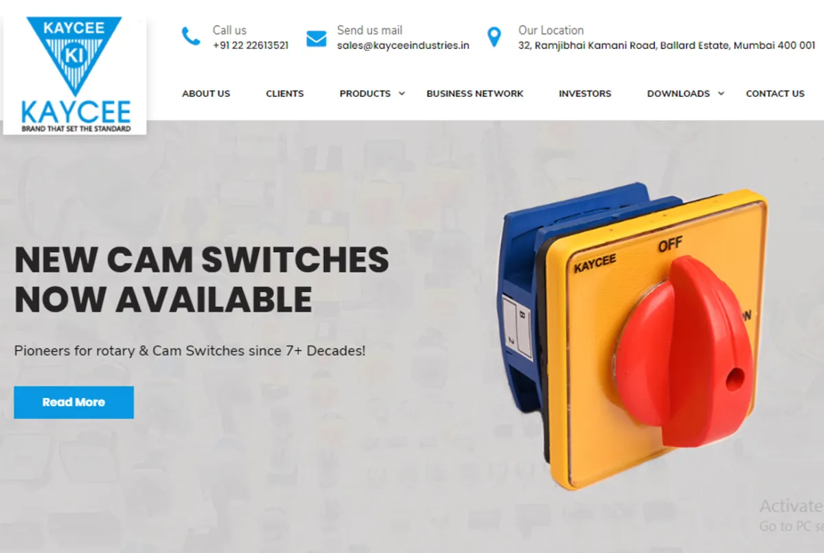
Kaycee Industries website
4xOnline enquiries
Page 1Google rankings
8Switch types catalogued
100%Mobile ready
Electrical SwitchgearCorporate WebsiteProduct CatalogueInvestor RelationsDownloads LibrarySEO

Kaycee Industries — Bringing a 75-Year-Old Switch Manufacturer Online

The Challenge

  • A catalogue across three families, switches, counters and hour meters, needed structure a buyer could navigate.
  • Variants such as micro against limit switches needed their own addresses, not one grouped page.
  • As a listed company, Kaycee had to publish filings and disclosures where shareholders could find them.
  • Seven decades of history and customers including ABB, BHEL and BARC sat unused as trust assets.
  • Buyers ask for certificates and brochures, yet no organised download library served them.

What We Did

  • We designed a clean industrial site with a homepage carousel and a credibility band covering years, team strength and client reach.
  • We structured a products mega menu by family and gave every switch, counter and hour meter type its own page.
  • We built a Clients section with logos, putting ABB, BHEL, BARC, Bluestar, C&S and Indian Railways in front of every visitor.
  • We structured an Investors section and split Downloads into Brochures and Certificates, including ISO and ERDA.
  • We wrote the About section around the pre-independence incorporation, the Ambernath plant and the Salzer Electronics relationship.
  • We handed over content management so the Kaycee team adds products, certificates and investor documents themselves.

Built With

PHPMySQLBootstrapMega Menu CatalogueDownloads LibraryInvestor SectionCMS
“Our product enquiries have quadrupled since the new website launched. The B2B catalogue they built makes it easy for industrial buyers to find specifications and send RFQs. Outstanding work.”— Sales Director, Kaycee Industries
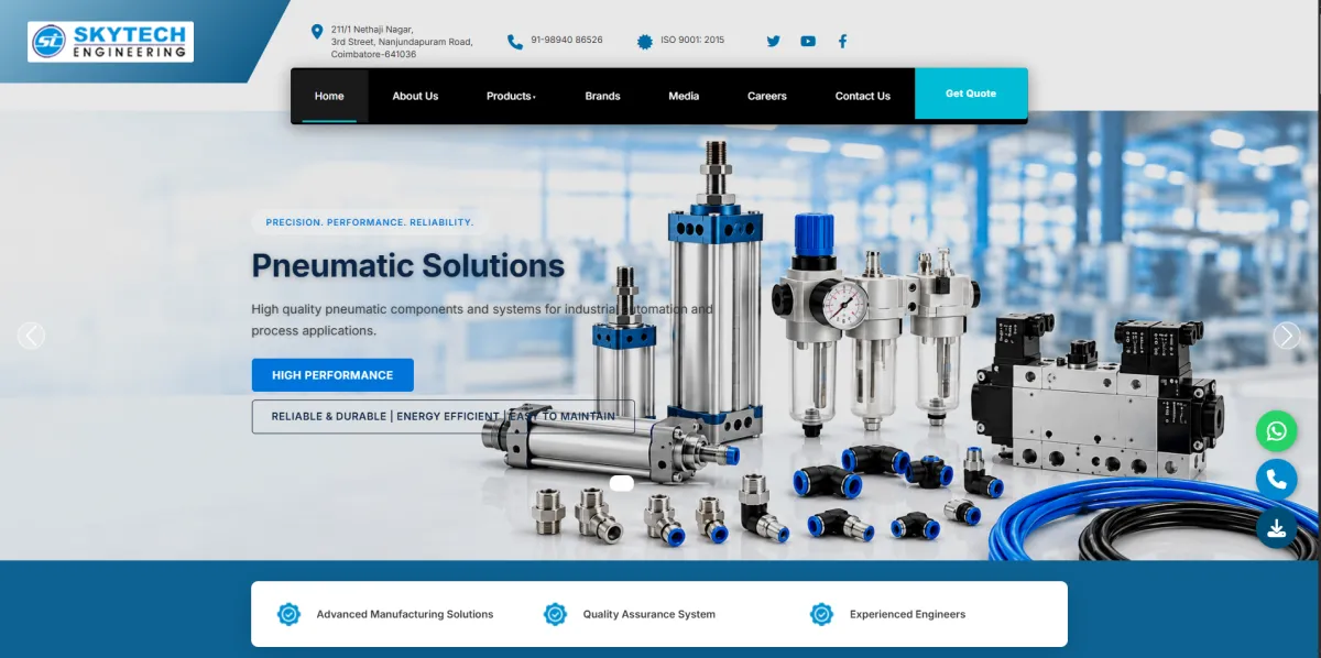
SkyTech Engineering website
6Product groups
8Industries served
ISO 9001Certification shown
100%Mobile ready
Industrial DistributionCorporate WebsiteProduct CatalogueBrand PagesQuote SystemSEO

SkyTech Engineering — A Distributor Catalogue Built for Industrial Buyers

The Challenge

  • Six product groups, Parker, piping, hose assembly, pneumatics, compressors and pipe assembly, each carried sub-items a flat list would bury.
  • Authorised Parker distribution is a major trust asset in this trade, yet it got only a passing mention.
  • Buyers often search by brand before component, so every represented brand needed a visible identity.
  • Enquiries here are quotation requests against a part number, which a general contact form handles badly.
  • Buyers stand on a plant floor with a phone, so mobile speed and a tap-to-message route were commercial needs.

What We Did

  • We designed a clean industrial site around the "Engineering Your Success" positioning, with a hero slider and What We Do category cards.
  • We organised the products mega menu into six groups and gave sub-items such as solenoid valves, PTFE hoses and FRL units their own pages.
  • We structured the Parker group by the manufacturer’s own divisions, matching what a Parker specifier expects.
  • We built Brands, Industries We Serve and Why Choose Us sections, with ISO 9001:2015 stated as a published position.
  • We placed a persistent Get Quote action in the header and enabled WhatsApp enquiry for part numbers and photographs.
  • We built the SEO structure around pneumatics, hydraulics and Parker distributor searches tied to Coimbatore.

Built With

PHPMySQLBootstrapMega Menu CatalogueQuote Request FormsWhatsApp Integration
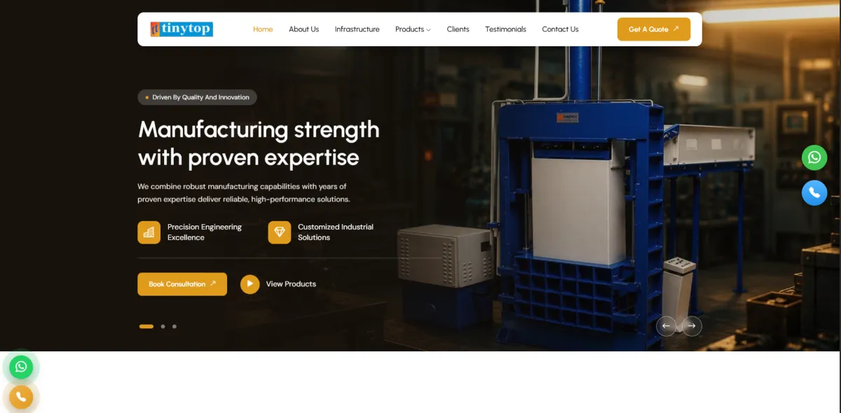
Tiny Top Engineering website
8Machines with own pages
4Baling materials covered
2Fabrication lines
100%Mobile ready
Industrial MachineryManufacturer WebsiteMachine Product PagesEnquiry SystemSEO

Tiny Top Engineering — A Product Catalogue Website for a Baling Press Manufacturer

The Challenge

  • Buyers search by material, cotton, coir or PET bottle baling, so one generic press page would miss most of the demand.
  • Marketplace listings carried the products but gave no credibility to Tinytop as a manufacturer.
  • The fabrication line, boiler chimneys and generator enclosures, is a different enquiry and needed separating.
  • In-house testing and infrastructure were real differentiators with nowhere to appear.
  • Enquiries arrive as questions about throughput, bale size and material, so the enquiry path had to invite a technical conversation.

What We Did

  • We designed a clean industrial site where machine photography dominates every page.
  • We gave each of eight machines its own page, from the textile baling press through to automatic cone packing.
  • We grouped boiler chimneys and generator enclosures as a separate fabrication offering.
  • We presented infrastructure across manufacturing, quality testing, R&D, and warehousing and packaging, with a plant gallery.
  • We designed the enquiry form to capture material, application and capacity, and enabled WhatsApp and phone contact.
  • We built the SEO structure around machine-level intent such as cotton baling press and coir baling machine.

Built With

PHPBootstrapMachine Product TemplatesEnquiry FormsWhatsApp Integration
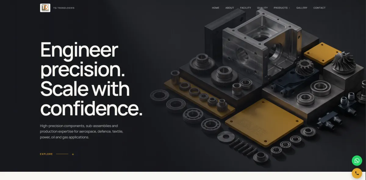
TQ Teknologies website
4Product families
8Process capabilities
5Sectors addressed
2Facilities published
Precision ManufacturingCorporate WebsiteProduct Family PagesCapability PresentationBlogSEO

TQ Teknologies — Positioning a Precision Manufacturer for Aerospace and Defence Buyers

The Challenge

  • Component makers usually show a photo gallery of parts, which says nothing about the processes behind them.
  • Eight process capabilities, from bar stock machining to surface coatings, had to read as one coherent offer.
  • Parts needed grouping into families a buyer recognises, so an enquiry lands in the right place.
  • Aerospace and defence buyers look for quality thinking, so the quality page had to say something specific.
  • Two facilities and several enquiry numbers had to be presented clearly, so a buyer knows who to call.

What We Did

  • We designed a restrained, engineering-first visual system where component geometry and material finish carry the pages.
  • We organised the products menu into four families and split them into eight addressable groups, from shafts and pins to sheet metal parts.
  • We built a Facility section presenting equipment and production systems, which is what a vendor audit checks first.
  • We wrote a Quality section in specific terms and published named leadership profiles for the two promoters.
  • We added an industrial thinking blog and an enquiry form with several published numbers, plus WhatsApp for drawings.
  • We published both Coimbatore facility addresses, so a buyer planning an audit visit knows where to go.

Built With

PHPMySQLBootstrapProduct Family TemplatesBlog ModuleWhatsApp Integration
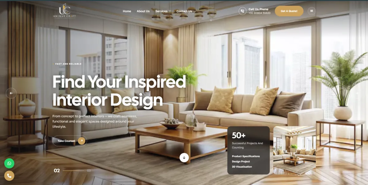
Unique Craft Architects website
6Discipline landing pages
3Project categories
5Process steps published
4Enquiry routes per page
Architecture and InteriorsService Landing PagesProject PortfolioGalleryEnquiry IntegrationLocal SEO

Unique Craft Architects — Turning a Coimbatore Design Studio Into a Digital Showroom

The Challenge

  • Prospects could not judge the studio’s aesthetic, because no page showed the completed work visually.
  • Nine offerings competed for attention, and none owned a landing page.
  • No page answered the local searches that drive this market, such as architects or interior designers in Coimbatore.
  • Two audiences needed serving at once: homeowners planning one residence, and businesses commissioning offices, retail or industrial premises.
  • Serious leads slipped away between a first visit and a phone call, because the site offered no structured enquiry route.

What We Did

  • We built the layout around large architectural photography with a restrained neutral palette, so materials and finishes carry the colour.
  • We split the offering into six pages: interior design, architecture, residential architecture, commercial interiors, 3D visualisation and home renovation, each on a city-named URL.
  • We built a Projects section grouped into single home, residential and landscape, with name, location and year on every commission.
  • We developed the About Us page around the vision, the named leadership and the five-step process from concept to handover.
  • We embedded FAQ blocks on scope, differentiators, materials and pricing transparency.
  • We placed a persistent quote request sitewide, backed by click-to-call, WhatsApp and email.

Built With

PHPBootstrapImage OptimisationFAQ BlocksWhatsApp IntegrationLocal SEO
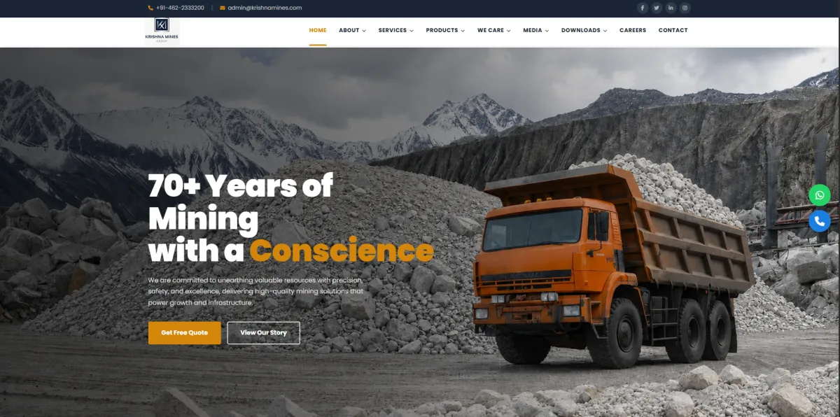
Krishna Mines website
3Limestone grades
7Contract mining stages
1958Founding year published
2Commercial routes
Mining and MineralsCorporate WebsiteProduct PagesCapability PresentationEnquiry SystemSEO

Krishna Mines — A Corporate Website for a Six-Decade Limestone Mining Group
The Challenge

  • Limestone is not one product. Cement grade, high grade and low grade serve different processes, so grade had to organise the catalogue.
  • Contract mining sells something completely different from material, and mixing the two would confuse both audiences.
  • Six decades of operating history is the strongest supply reliability signal in this sector, and the business showed it nowhere.
  • New buyers treat named institutional customers as proof, so those relationships needed a credible place on the site.
  • Buyers also judge how a mine handles land and community, so reclamation capability needed visibility.

What We Did

  • We built a solid industrial visual system on quarry and plant photography, with the 1958 founding established on the homepage.
  • We organised products by grade and tied each grade description to its end use, so a buyer matches material to process.
  • We separated slaked lime powder and processed mineral outputs from bulk limestone, because they serve a different buyer.
  • We built a distinct Contract Mining section covering all seven stages, from consulting and geology assessment to land reclamation.
  • We presented the cement industry relationships, including The India Cements Ltd, and a gallery of quarry and plant equipment.
  • We structured the enquiry form so a buyer specifies grade and volume in the first message, with the Tirunelveli location clear.

Built With

PHPMySQLBootstrapProduct TemplatesEnquiry FormsCMS
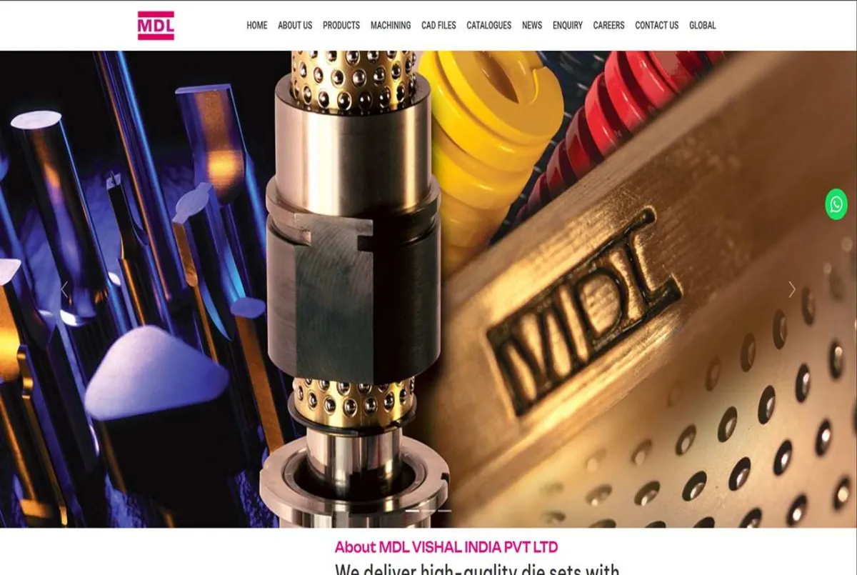
MDL India website
6Product families
5Machining capabilities
4Manufacturing countries
100%Products inspected
Metal Stamping ComponentsProduct PagesServices PagesCAD Download LibrarySEO

MDL India — A Focused Product and Services Website for a Global Die Set Manufacturer

The Challenge

  • The Indian plant had only just opened, so the site had to place it inside an established global group rather than present a new unknown.
  • Die sets, guiding components and machining services are three different purchase decisions, so each one needed its own route.
  • Capacity figures qualify a supplier in this trade, so the site had to show the grinding and machining envelopes instead of hiding them.
  • Tool designers work from CAD, so downloadable CAD files had to be a first class part of the site.
  • The 100 per cent inspection policy was the clearest differentiator, and no page told a buyer about it.

What We Did

  • We built a clean technical visual language and stated on the homepage what the company makes and who it makes it for.
  • We gave die sets, guide pillars, bushings, ball bearing cages, compression springs and guiding components their own pages.
  • We built a distinct Services section and published the capacities: Blanchard grinding up to a 2130 mm diagonal and 900 mm height, machining up to 3000 x 1500 x 500 mm.
  • We added a CAD files section organised so a designer finds the right file without walking the whole catalogue.
  • We presented the global footprint as supply assurance: Brazil, Mexico, France and India for manufacturing, Germany and the USA for distribution.
  • We handed over content management, so the client’s own team maintains the product and download listings.

Built With

PHPMySQLBootstrapCAD Download LibraryEnquiry FormsHTTPS
“A professional, secure institutional website was essential for us. Samantha Technologies delivered exactly that — credible design, dynamic content management, and strong performance.”— IT Manager, MDL India
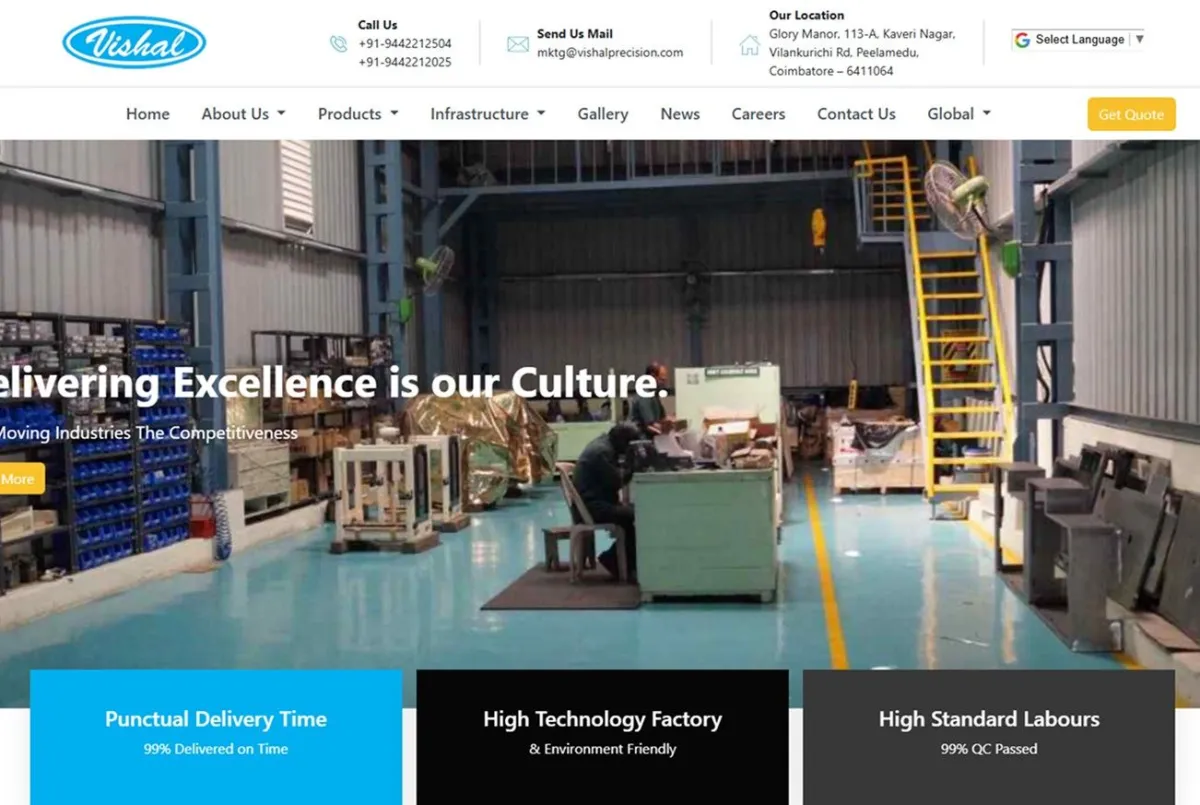
Vishal Precision website
6xInternational enquiries
8Product lines
5Export markets named
300+Clients worldwide
Precision EngineeringExport WebsiteProduct CatalogueInfrastructure PagesNews ModuleQuote System

Vishal Precision — A Global Export Platform for a Coimbatore Mould Base Manufacturer

The Challenge

  • Eight product lines each draw a different enquiry from a different buyer, so each needed its own page.
  • Export buyers assess infrastructure before price, so the site had to show machining and inspection capability.
  • ISO 9001:2015 held since 1994 is a serious credential, and it needed a home beside awards and history.
  • The 300-plus client base and the long relationships were the strongest proof available, and the site used neither.
  • The goal was a quote against a drawing, so the enquiry path had to suit that, not general contact.

What We Did

  • We built a clean precision-engineering visual system with a hero slider and split About Us into History, Certificates and Awards.
  • We built a products menu covering all eight lines, each with its own page, application context and clean URL.
  • We split Infrastructure from Capabilities and presented CNC machining centres, CMM and height master as audit evidence.
  • We published ISO 9001:2015 and the ZED top 200 ranking, and stated the 300-plus client base beside a logo section.
  • We built a Global section with market flags for Italy, Dubai and Sharjah, the UK, Japan and Germany, plus a News module.
  • We placed a persistent Get Quote action in the header, with WhatsApp beside the form and a Careers page for recruitment.

Built With

PHPMySQLBootstrapNews ModuleLightbox GalleryInternational SEO
“We needed a website to impress German and European buyers. Samantha Technologies delivered exactly that — professional, fast, technically detailed and credible. Our international enquiries grew 6x.”— Export Manager, Vishal Precision
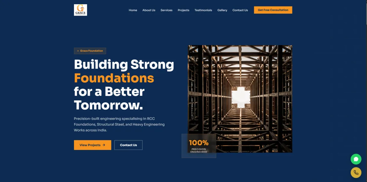
Grace Foundations website
6Service disciplines
4Project filters
3Credentials published
4Enquiry channels
Civil and Structural EngineeringService PagesFilterable Project PortfolioConsultation FunnelLocal SEO

Grace Foundations — A Project-Led Website for a Structural Engineering Contractor

The Challenge

  • Six services span RCC work and steel fabrication, and one shared page would make the company look like a generalist.
  • Commercial, industrial and residential developers evaluate differently, so the projects needed filtering by segment.
  • Scale qualifies a contractor in this trade, so storeys, square footage and unit counts had to show on each project.
  • The ISO 9001 certification, certified engineers and IS code compliance had nowhere to sit, despite mattering to procurement.
  • Contracting enquiries start as a site visit or consultation request, so the funnel had to match.

What We Did

  • We built a structural visual system led by real steel and concrete imagery, with years in business and client retention high on the page.
  • We built a Services section covering all six offerings, grouped into the concrete side and the steel side of the business.
  • We built a Projects section with four views, All, Commercial, Industrial and Residential, each project carrying location, type and a scale figure.
  • We published named testimonials, ISO 9001 certification, certified structural engineers, IS code compliance and the safety-first position.
  • We placed a Get Free Consultation action in the main navigation, with tap-to-call, WhatsApp and an embedded map.
  • We handed over content management, so the team adds projects, gallery images and testimonials without a developer.

Built With

PHPMySQLBootstrapFilterable Project GridWhatsApp IntegrationGoogle Maps
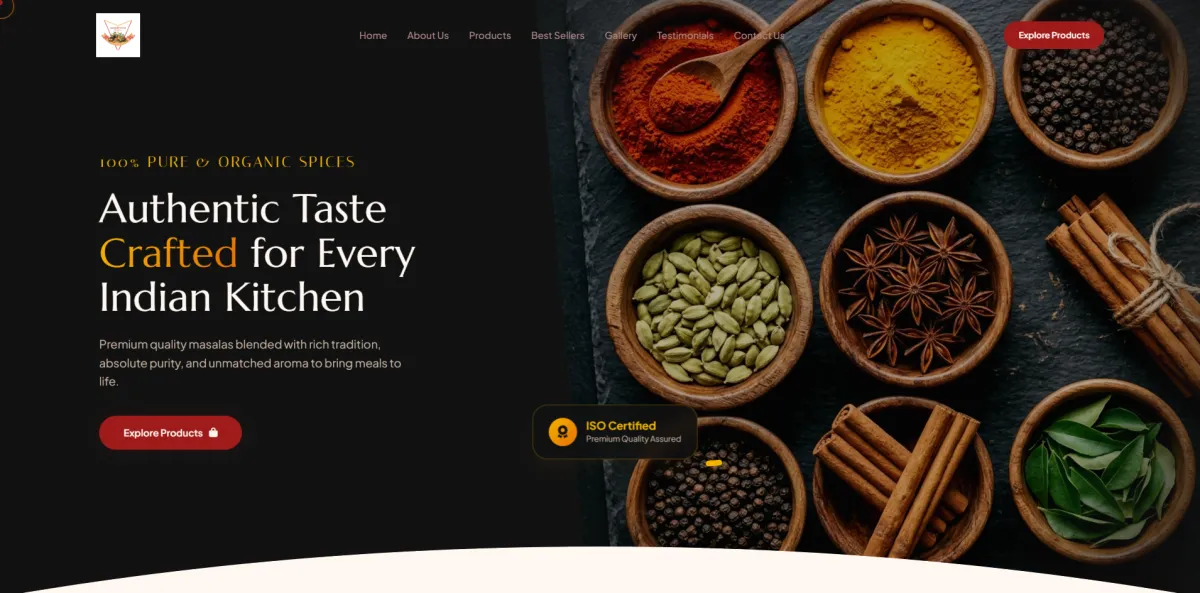
Muhurtham Masala Foods website
1Page per product
2Audience routes
4Buyer types served
2Pack formats shown
Food ManufacturingProduct CatalogueBrand StorytellingTrade Enquiry FunnelSEO

Muhurtham Masala Foods — A Brand and Product Website for a Masala Manufacturer

The Challenge

  • Households and trade distributors ask completely different questions, so the site had to separate them without becoming two sites.
  • Customers choose spice brands on trust, so the site had to communicate quality, hygiene and food safety rather than assume them.
  • A customer hunting one specific masala will not browse a combined range image, so every product needed its own presentation.
  • Brand story is a regional producer’s main defence against a national competitor, and it needed proper space.
  • Distributor and stockist enquiries grow a brand of this size, so they needed their own route.

What We Did

  • We built a warm, appetising visual system on product and food photography, drawing colour and typography from the packaging.
  • We presented every masala and spice powder individually, each with its own page, clean URL and pack size information.
  • We built a brand story section and published quality, hygiene and food safety compliance where retailers and consumers look.
  • We kept a separate distributor and stockist route, so a trade enquiry never gets lost among consumer messages.
  • We enabled WhatsApp enquiry and published contact details directly, so a stockist can call instead of waiting.
  • We handed over content management, so the team adds products and updates packaging images without a developer.

Built With

PHPBootstrapProduct TemplatesWhatsApp IntegrationImage Optimisation
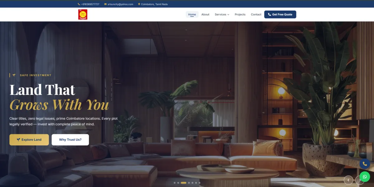
Suncity Developers website
6Locations marketed
7Documents listed
3Banks named
4Buying process steps
Real Estate and ConstructionService PagesProject Listing ArchitectureLead CaptureLocal SEO

Suncity Developers — Selling Land with Documented Confidence

The Challenge

  • The team explained each layout’s location, plot size range and starting price verbally, one enquiry at a time.
  • Legal clarity is the company’s strongest differentiator, and no page let a buyer read it at their own pace.
  • Land sales and home construction are two different offerings, and the site had to hold both without burying either.
  • Loan eligibility and bank tie ups decide the purchase for salaried buyers, and the offer never mentioned them.
  • This audience is overwhelmingly mobile, yet no mobile first presentation of layout details existed.

What We Did

  • We built a warm, land and sunlight led visual identity, with the core promise of legally clear property in the hero.
  • We split the offering into two service pages, land and plots and building construction, with a repeatable layout card per project.
  • We created a documentation section naming every document handed to a buyer, from the sale deed to the possession certificate.
  • We surfaced DTCP approval on each layout and presented pre approval with SBI, HDFC and Axis Bank as part of the offer.
  • We published the four step buying process: consultation, site visit, legal verification and registration.
  • We added a permanent Get Free Quote action, click to call and WhatsApp links that open with a pre written message.

Built With

PHPBootstrapServer-side FormsWhatsApp Deep LinksLocal SEO
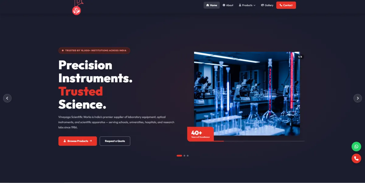
Vinayaga Scientific Works website
600+Products catalogued
5Product ranges
4Condenser patterns
2Certifications shown
Laboratory EquipmentProduct CatalogueCategory ArchitectureGallery ModuleEnquiry WorkflowSEO

Vinayaga Scientific Works — A Searchable Catalogue for Four Decades of Precision Glassware

The Challenge

  • The old site showed no structured product presentation, so Vinayaga could only share hundreds of items as offline lists.
  • Five ranges serve five different industries, and a poultry laboratory buyer and a petroleum testing buyer share almost no vocabulary.
  • No product had its own address, so nobody could send a buyer a link to a single item.
  • Four decades of manufacturing, ISO certification and BIS approval built no technical credibility before a quotation request.
  • Enquiries arrived without product context, so every quotation began by clarifying the item and the specification.

What We Did

  • We built a restrained, laboratory appropriate visual language in clean whites, with founding year, certification and range size high on the homepage.
  • We built a category driven catalogue with a dedicated, linkable view for each of the five ranges and a View Details page for every product.
  • We structured the About page around the 1986 founding, the borosilicate 3.3 capability and the industries served.
  • We published ISO 9001:2015, BIS approval and the four differentiators the client stands on, with a lightbox gallery of real product photography.
  • We made the quotation request the primary action, with click to call, WhatsApp, three telephone numbers and working hours published.
  • We added new products and ranges as records, so the client never rebuilds a page.

Built With

PHPMySQLCategory Driven CatalogueLightbox GalleryWhatsApp IntegrationHTTPS
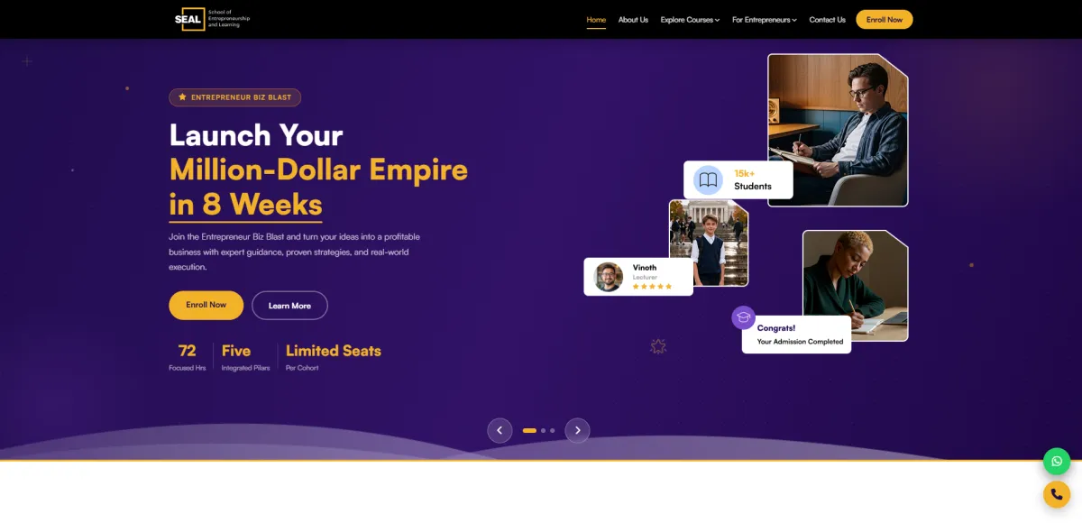
SEAL Education website
5Course menu groups
5Named programme pages
3Awarding partners shown
40+Countries of learners
Higher EducationCourse ArchitectureEnrolment FunnelCMSSEO

SEAL Education — A Course Discovery and Enrolment Platform for a Blended Learning College

The Challenge

  • Degree seekers, working professionals and entrepreneurs ask different questions, and one flat listing would have failed all three.
  • Programmes came from several sources, so each partner’s credibility needed to stay visible.
  • Enrolment takes a long window, so the site needed a low commitment entry and a direct enrolment route.
  • A blended online model needs explaining, because learners from a campus mindset want to know how it works.
  • The entrepreneurship track carries its own promise and audience, so it needed its own navigation route.

What We Did

  • We built a modern, education focused visual system with rotating banners and a credibility band of universities, countries and mentors.
  • We grouped Explore Courses into Bachelors, Masters, Free Courses, NCC Education and Collaboration Courses, with a page per programme.
  • We added a separate For Entrepreneurs section carrying ELP Certificate Programs, the ELP MBA and Entrepreneur Biz Blast.
  • We displayed partner logos for NCC Education, the Digital Marketing Institute and Harvard Business School Online as a trust row.
  • We added a persistent Enroll Now action and a Free Career Counselling form as the softer path, with WhatsApp across time zones.
  • We handed over content management, so the SEAL team adds programmes, partners and testimonials themselves.

Built With

PHPMySQLBootstrapMulti Level Course MenuWhatsApp IntegrationCMS
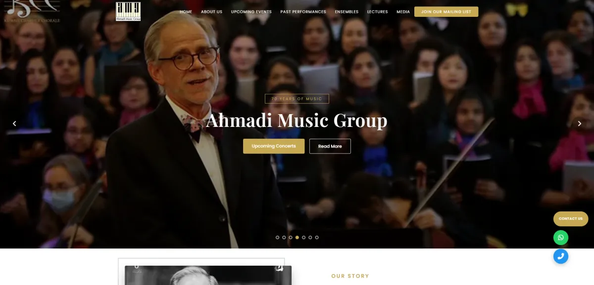
Ahmadi Music Group website
5Ensembles presented
70Years of music
30+Member nationalities
4Social channels linked
Performing ArtsEvents ArchitectureMedia GalleryMailing List IntegrationSEO

Ahmadi Music Group — A Digital Home for Kuwait’s Oldest Classical Music Ensemble
The Challenge

  • Five ensembles serve genuinely different audiences, yet one group identity flattened symphonic, choral, chamber, youth and jazz into a single voice.
  • Concert dates are perishable information, and an announcement had nowhere to live and nothing to link to.
  • Seven decades of performance history sat out of public view, even though it is the group’s greatest asset.
  • Prospective members, especially players new to Kuwait, could not tell which ensemble suited them or how to make contact.
  • Audience retention needs a mailing list, because a contact form alone cannot reach people before the next concert.

What We Did

  • We designed a refined, uncluttered visual system with a banner carousel from real performance imagery and the "70 years of music" positioning.
  • We built an Ensembles section giving the Choir, the Orchestra, the Messila Chamber Ensemble, the AMG Youth Orchestra and the Kuwait Jazz Collective a space each.
  • We made Upcoming Events the site’s primary active area and built a Past Performances archive, with Lectures on its own route.
  • We built a Media gallery and linked Instagram, Facebook, YouTube and Vimeo.
  • We added a Join our Mailing List action to the main navigation and a contact form for prospective members, venues and collaborators.
  • We added WhatsApp contact with a scannable code and handed over content management to volunteers.

Built With

PHPBootstrapEvents ModuleMailing ListMedia GalleryWhatsApp QR
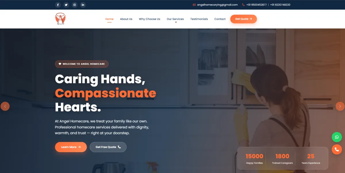
Angel Home Care website
8Service pages
4Onboarding steps published
98%Satisfaction rate stated
24/7Availability published
Home HealthcareService PagesQuote SystemTestimonials ModuleLocal SEO

Angel Home Care — A Service-Led Website for a Home Care Provider

The Challenge

  • Eight services, from palliative care to cooking, serve very different needs and could not sit as one undifferentiated list.
  • Trust decides the purchase, so caregiver training, experience and vetting had to appear where an anxious family sees them.
  • Families often decide on a phone in a hospital corridor, so tap to call and messaging beat any form.
  • Families want to know what happens next, so the onboarding process needed explaining rather than assuming.
  • Pricing anxiety blocks real enquiries, so the transparent pricing position needed a visible place on the site.

What We Did

  • We designed a warm, reassuring visual system around real care imagery, with statistics counters high on the page.
  • We built an Our Services menu with a dedicated page for each of the eight services, structured the same way: what is included, who it suits and an enquiry action.
  • We built a Why Choose Us section, presented caregiver credentials plainly and laid out the four step onboarding process.
  • We stated the transparent pricing position and the 24 by 7 commitment, and added a Testimonials section.
  • We added a Get Quote action to the main navigation, made all three published numbers tap to call and enabled WhatsApp.
  • We embedded a map with the Pappanaickenpalayam address and built local SEO around home nursing and elder care in Coimbatore.

Built With

PHPBootstrapQuote FormsWhatsApp IntegrationGoogle MapsLocal SEO
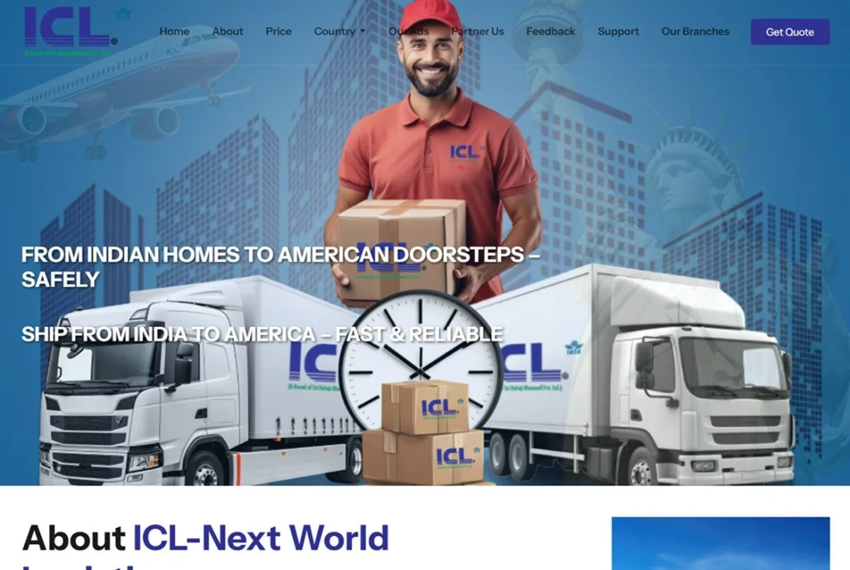
ICL Next World Logistics website
10Site sections
6Carriers named
2Country routes
3-5Day delivery window
Courier and ExpressCountry PagesPricing PresentationPayment and Partner FunnelsSEO

ICL Next World Logistics — A Cross-Border Parcel Platform for an India to USA Courier Network

The Challenge

  • Pricing is the first question every customer asks, and an enquiry form loses them to a competitor who publishes rates.
  • Destination countries carry different rates, restrictions and transit times, so one international page would fail.
  • Customers sending food, medicine and appliances need to know what is permitted.
  • The business grows through agents and franchise partners, so it needed a partner path beside the customer path.
  • Customers pay remotely, often for family members, so the site needed an online payment route.

What We Did

  • We designed a bright, approachable visual system with a homepage carousel carrying the India to America positioning.
  • We added a Country menu with dedicated routes for America and the United Kingdom, and presented four distinct services.
  • We gave Price its own route in the main navigation and published the shippable categories explicitly.
  • We built a Globally Recognised section presenting DHL, FedEx, UPS, TNT, Aramex and BlueDart, and surfaced FeTNA and NORKA sponsorship.
  • We built Our Branches, Make Payment and Partner Us sections, and separated Feedback from Support.
  • We added WhatsApp and tap to call across both published numbers and linked five social channels.

Built With

PHPBootstrapOnline Payment RouteWhatsApp IntegrationCMS
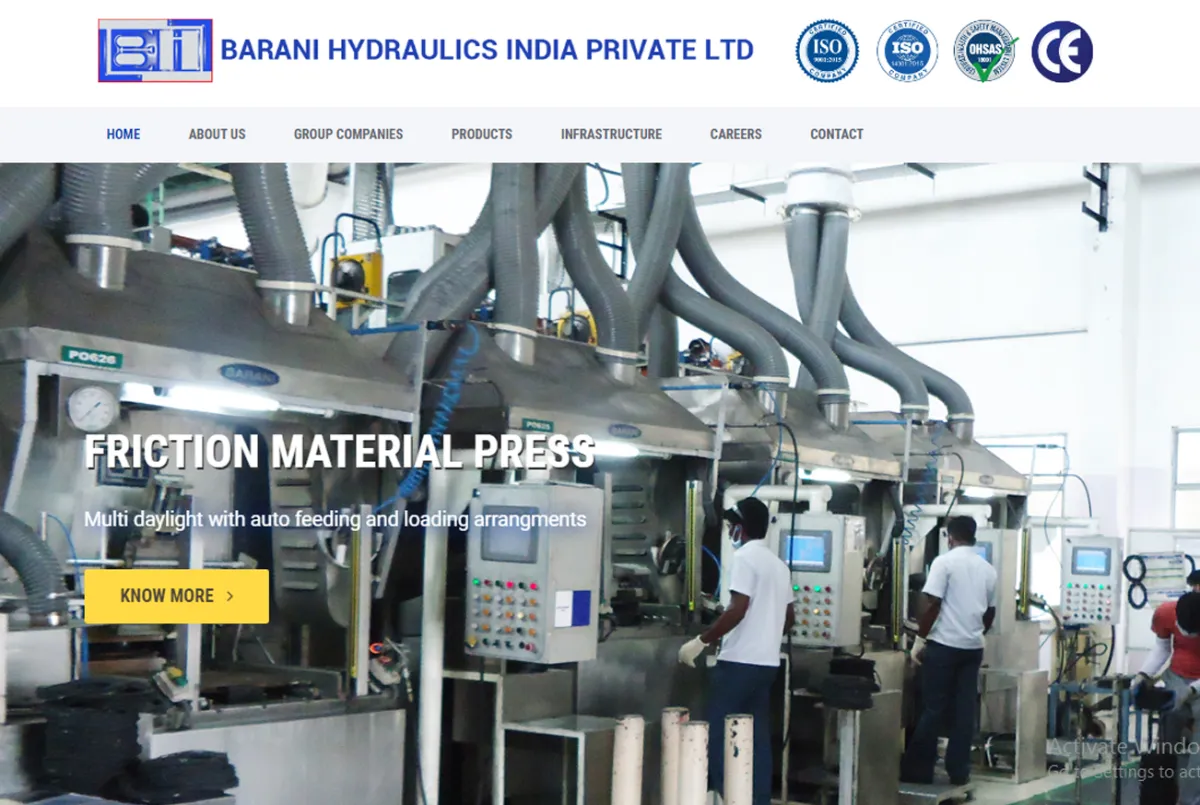
Barani Hydraulics website
13Press families
3Divisions presented
3ISO certifications
30+Export countries
Hydraulic and Servo PressesDynamic Product CatalogueDivision PagesCareers and Supplier SectionsCMSSEO

Barani Hydraulics — Engineering Authority Online for a Multi-Division Press Manufacturer

The Challenge

  • The old site gave no structured presentation for thirteen press families, components and castings, so buyers could not reach the machine they needed.
  • A three division group structure showed no hierarchy, so visitors could not tell what each division made.
  • Differentiators such as servo driven pump control and programmable motion profiles never appeared in assessable form.
  • Certifications, EHSQ practice and sustainability commitments count in supplier qualification, yet the site never presented them.
  • Four audiences needed serving at once: OEM buyers, prospective suppliers, job seekers and institutional visitors.

What We Did

  • We built a dark industrial visual language on real plant and machine imagery, with years, divisions, workforce and countries visible early.
  • We created a Barani Group parent section with a page per division and a separate place for the group’s engineering college.
  • We built a database driven product catalogue grouped under Press Manufacturing, Pressed Components and Assembly, and Castings, with a detail page per press family.
  • We structured capability content into Design and Development, Tooling and Automation, and presented ISO 9001, 14001 and 45001 as supplier qualification content.
  • We developed a Sustainability section covering the four CSR pillars and a customer reference section naming Schaeffler, TATA, Valeo and Michelin.
  • We added separate Careers and Supplier forms, so vendors and applicants never crowd the sales enquiry.

Built With

PHPMySQLDatabase Driven CatalogueMulti Level NavigationCMSGoogle Analytics
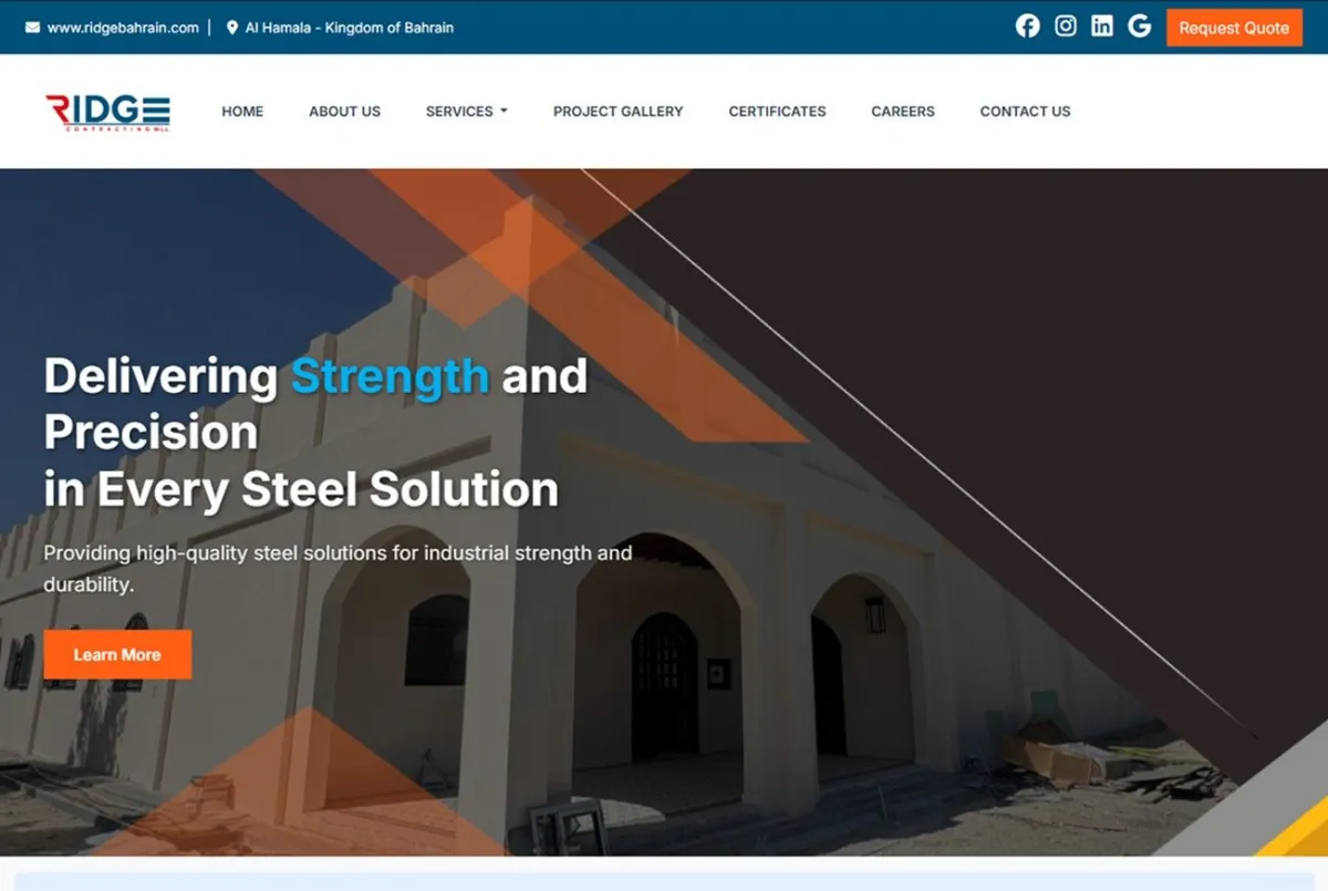
Ridge Bahrain website
8Service lines
2ISO certificates
8Named projects shown
5Project sectors
Steel Fabrication and ContractingService PagesProject GalleryCertificate SectionCareers PageSEO

Ridge Bahrain — Structural Strength Made Visible for a Bahrain Steel Fabricator

The Challenge

  • The old site gave no structured presentation of eight distinct service lines.
  • A substantial built portfolio sat only in company records, so clients saw no evidence of scale or range.
  • ISO 9001 and ISO 45001 decide prequalification in Bahrain’s industrial and government sectors, and the site showed neither.
  • Four audiences needed serving at once: main contractors, project consultants, government bodies and job applicants.
  • The site offered no enquiry path, so interest from word of mouth had no route into the business.

What We Did

  • We built a visual identity suited to heavy steel construction, using site photography of fabricated frames, roofing and erected structures.
  • We gave each of the eight services a defined place, leading with structural steel fabrication and erection.
  • We built a Project Gallery naming completed works including DHL, SULB Steel, Foulath, Dana Mall and King Abdullah Medical City.
  • We created a dedicated Certificates page for ISO 9001:2015 and ISO 45001:2018, and a separate Careers page.
  • We placed the direct phone number and a WhatsApp link within reach, matching how Gulf enquiries arrive.
  • We developed a Contact page with an enquiry form, a mapped location at Al Hamala and links to Instagram and LinkedIn.

Built With

PHPBootstrapImage OptimisationWhatsApp IntegrationGoogle Analytics
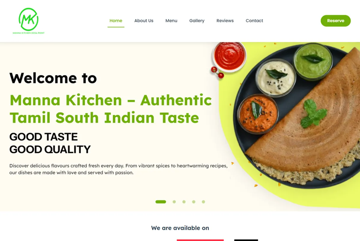
Manna Restaurant website
50+Dishes presented
6Menu categories
3Delivery platforms linked
4.9Star average published
RestaurantMenu PresentationPhoto GalleryReviewsWhatsApp ReservationDelivery Platform Links

Manna Restaurant — Authentic Tamil Flavours, Presented for a Dehradun Audience

The Challenge

  • The restaurant owned no digital presence, so third-party listings decided whether diners found it.
  • More than fifty dishes across dosa, idly, rice, non-vegetarian and dessert categories had no structure.
  • The authenticity claim, central to a Tamil kitchen outside Tamil Nadu, had nowhere to sit.
  • Strong word of mouth and platform ratings sat scattered rather than in one visible place.
  • Table bookings depended on phone calls, which staff could not always answer during service.

What We Did

  • We built the design around large, warm food photography with the authentic Tamil South Indian promise in the first screen.
  • We built a dedicated menu page led by the dosa range, then idly, tiffin, rice, non-vegetarian and dessert items.
  • We developed an About Us page carrying the 2010 origin story and a Reviews section so ratings sit on Manna’s own site.
  • We added a Reserve action to the main navigation and integrated WhatsApp reservation on both restaurant numbers.
  • We linked the Swiggy, Zomato and Uber Eats listings, so delivery customers hand off cleanly.
  • We built a Contact page with the full Sahastradhara Road address, the Pacific Golf Estate landmark and map access.

Built With

PHPBootstrapWhatsApp IntegrationImage CompressionLocal SEO
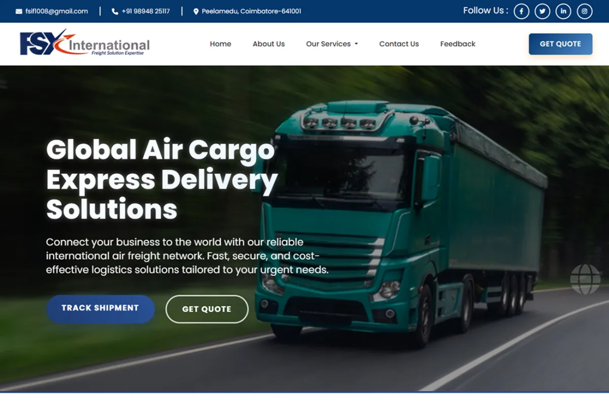
FSX Logistics website
7Service pages
3Transport modes separated
25Years experience published
4Quote form fields
Freight ForwardingService PagesQuote FunnelTracking Integration StructureSEO

FSX Logistics — A Service-Led Freight and Logistics Website

The Challenge

  • Seven distinct services across three transport modes and several value-added offerings needed structure, so a shipper could spot their own requirement.
  • Shippers choose road, air and sea freight on different criteria of cost, speed and volume, so each mode needed its own page.
  • Customers use a forwarder’s website for shipment tracking after booking, so tracking could not be an afterthought.
  • The commercial goal is a rate enquiry, so the quote path had to be the most visible action on every page.
  • Shippers and purchase managers check options from a phone, which made responsive performance a requirement.

What We Did

  • We designed a clean, contemporary visual system on real freight imagery, with the 25 years of experience placed high.
  • We built an Our Services menu with a dedicated page for each of the seven offerings, including road, air and sea freight.
  • We grouped drop shipping and warehousing as the value-added layer and surfaced shipment tracking and 24 hour support.
  • We placed a persistent Get Quote action in the header and structured the form around origin, destination, mode and cargo type.
  • We added a Feedback route to separate service issues from new business, and enabled WhatsApp contact.
  • We prepared the structure for a tracking integration and handed over content management.

Built With

PHPBootstrapQuote Request FormsWhatsApp IntegrationTracking Ready Structure
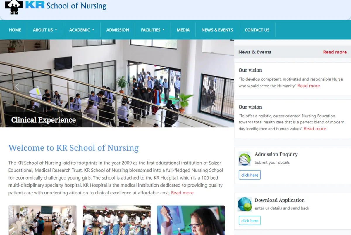
KR Nursing School website
10Facilities presented
4About pages
100Beds at attached hospital
2Admission routes
Nursing EducationAcademic and Facilities PagesAdmission EnquiryApplication DownloadNews ModuleSEO

KR Nursing School — An Admissions-Focused Website for a Nursing School

The Challenge

  • The school offers a single diploma, so the site had to build confidence through everything surrounding the course.
  • Hostel, safety, transport and canteen arrangements often decide the choice, so they needed genuine prominence.
  • Employers value clinical exposure, so the attachment to KR Hospital needed foregrounding as the school’s greatest advantage.
  • Admission enquiries arrive seasonally and in volume, so the site needed an enquiry form and a downloadable application form.
  • Many families research on one shared phone, which makes mobile performance and a downloadable form essential.

What We Did

  • We designed a calm, institutional visual system using real clinical training and classroom photography, written for parents as much as applicants.
  • We split About Us into About KR Nursing, Specialty, Achievement, and Faculty Strength and Experience.
  • We built an Academic section for the Diploma in General Nursing and Midwifery and a Facilities section across ten individual areas.
  • We named KR Hospital and its 100-bed multi-disciplinary status as the source of clinical exposure.
  • We built a dedicated Admission section with an enquiry form and a downloadable application form.
  • We added News and Events and Media sections, so staff publish admission dates and campus photography themselves.

Built With

PHPMySQLBootstrapDownloadable FormsNews ModuleCMS
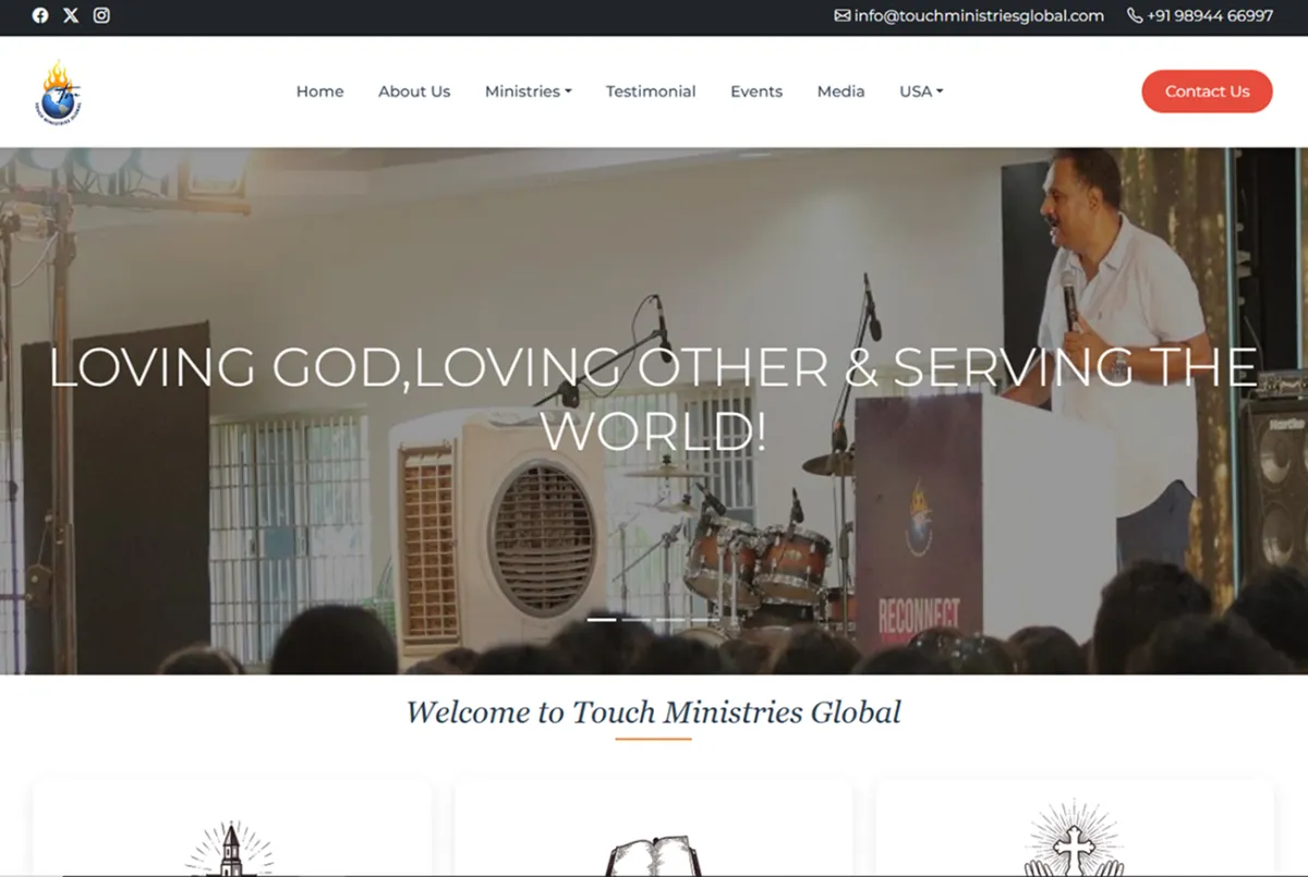
Touch Ministries Global website
7Ministry pages
3Countries served
2Forms built
3Team-managed modules
Faith-Based OrganisationMinistry PagesEvents ModuleMedia GalleryPrayer Request SystemSEO

Touch Ministries Global — A Multi-Country Ministry Website Built Around Programmes and Events

The Challenge

  • Seven distinct ministries, from a youth conference to a marriage programme, serve different audiences and could not share one list.
  • India, the United States and Australia each needed serving, without the site splitting into three websites.
  • Events are the main activity, and event information carries no value if nobody can find or share it.
  • Testimonies persuade a new visitor more than anything else, yet they sat scattered through social posts.
  • Prayer requests are a core pastoral function and needed a private, dependable route on the site.

What We Did

  • We designed a warm, welcoming visual system from real gathering and conference photography, with a banner slider carrying the mission line.
  • We built a Ministries menu giving the prayer fellowship, Annual Youth Conference, Ignite your Marriage, Agape, Outreach, Word and Worship and Women’s Fellowship their own pages.
  • We built an Events section with a permanent, shareable page per event, and a Testimonial section in participants’ own words.
  • We added a dedicated USA route to the main navigation and published Australian and American contact numbers alongside the Madurai address.
  • We built a prayer request form and a general contact section, protected with spam filtering.
  • We handed over content management, so the team publishes events, adds testimonies and uploads photographs.

Built With

PHPBootstrapEvents ModulePrayer Request FormsMedia GalleryCMS
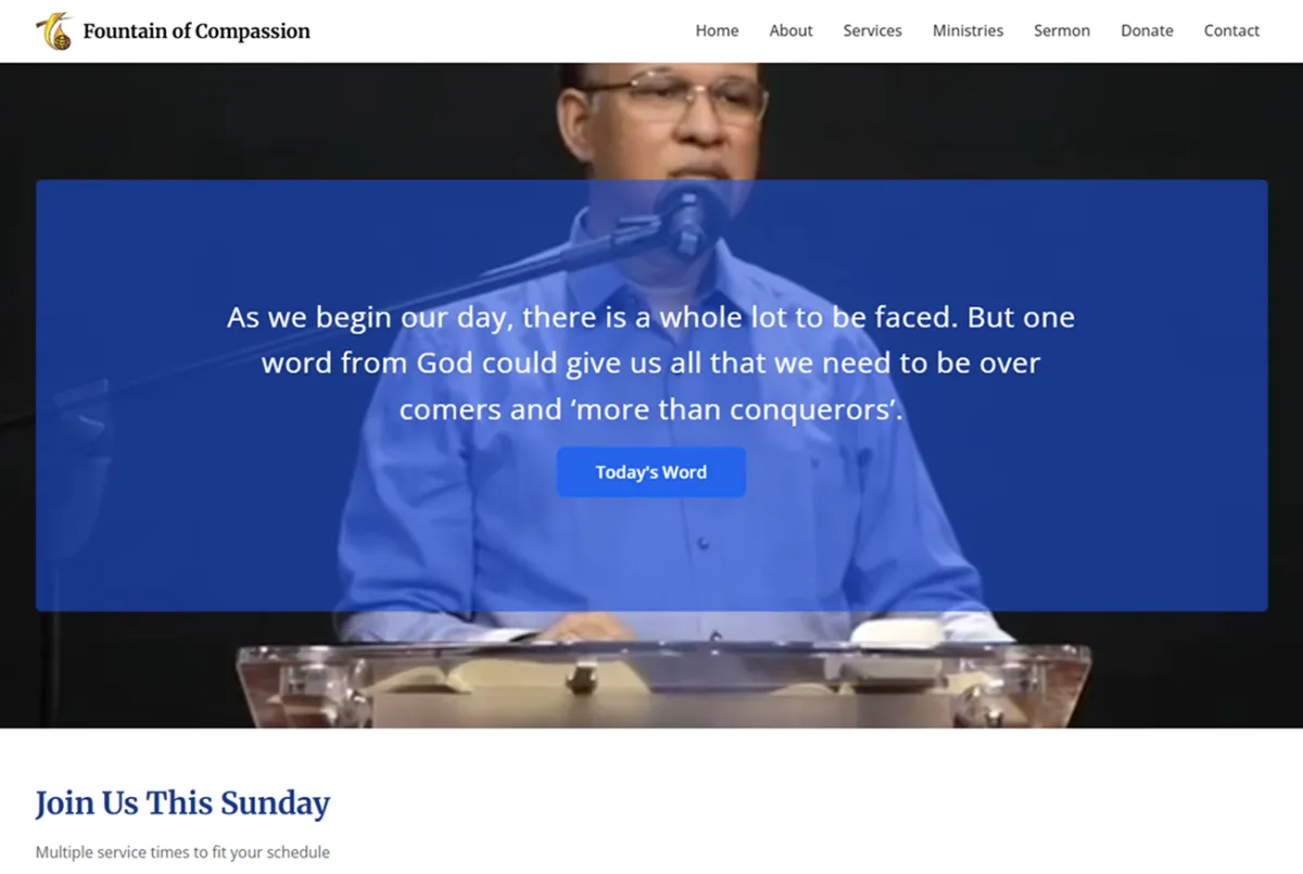
Fountain of Compassion website
4Outreach initiatives
7Navigation sections
500+Congregation from 20 founders
3Social channels linked
NGO and ChurchContent ArchitectureMinistry and Sermon SectionsDonation PageEnquiry FormsSEO

Fountain of Compassion — Bringing a Twenty-Five Year Ministry Online

The Challenge

  • Twenty-five years of history, including the founding and the moves to the present premises, survived only as oral and printed record.
  • The four outreach initiatives were the strongest credential, yet nothing explained each one to a potential supporter.
  • A ministry already producing television and social video had no destination, so broadcast audiences leaked away.
  • Giving happened entirely offline, with no page naming the causes funded or a way to respond.
  • Doctrinal position and leadership credibility decide a church audience, and neither appeared anywhere a stranger looks.

What We Did

  • We designed for warmth and legibility, with the mission and vision given deliberate prominence on the home page.
  • We split worship and weekly gatherings under Services and outreach under Ministries, giving Poor Feeding, Educating Poor Children, the Senior Care Home and the Prayer Ministry their own treatment.
  • We structured the About page into About Us, Mission Statement, Statement of Faith and Doctrinal Foundation, with the founding story as a history section.
  • We built a Sermon section with a "Today’s Word" entry point and linked the television programming and social channels.
  • We placed a Donate page in the primary navigation, tied to the four outreach initiatives.
  • We published the full Trichy address, the office landline, two mobile numbers and the ministry email, with click-to-call.

Built With

PHPBootstrapSermon SectionDonation PageNewsletter SubscriptionServer-side Forms
TQ Technologies website
5Sectors named
8Promoter experience areas
1 monthBrief to live site
1Owned email domain
Precision ManufacturingLaunch WebsiteCapability PagesProduct PresentationDomain and Email SetupSEO

TQ Technologies — The First Digital Presence for a Precision Manufacturing Venture

The Challenge

  • With no trading history to show, credibility had to rest on capability and the promoters’ background.
  • Aerospace, defence and oil and gas buyers apply higher qualification standards, which raised the bar.
  • The business needed an owned domain identity for email and correspondence, a practical need as much as a marketing one.
  • A first website has to launch quickly, without weakening the impression it makes.
  • The site had to form a foundation the company could build on rather than discard.

What We Did

  • We designed a clean, engineering-led visual system and stated what the business makes and which sectors it serves within the first screen.
  • We led with machining and manufacturing capability, because process is what a technical buyer assesses first.
  • We presented promoter experience across design, machining, procurement, vendor development and special purpose machines as the honest basis for confidence.
  • We established the .in domain as the venture’s owned identity for both website and business email.
  • We designed an enquiry route for technical conversations, capturing the specification detail a first reply needs.
  • We built a structure that later supported the company’s move onto its wider .com platform, so no work was wasted.

Built With

PHPBootstrapDomain and Hosting SetupBusiness EmailEnquiry Forms
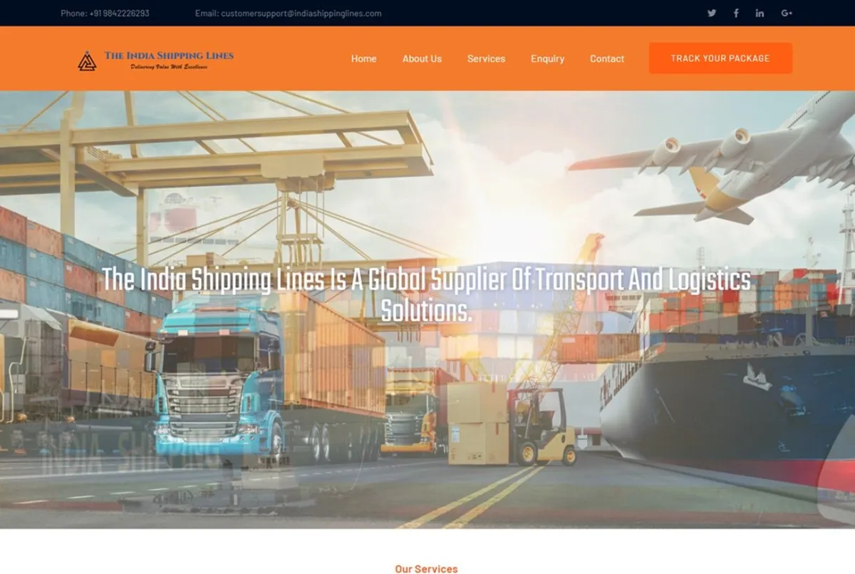
India Shipping Lines website
3Core services separated
3Documentation capabilities
4Rate enquiry fields
4Customer types addressed
Shipping and FreightService PagesCredential PresentationRate Enquiry FunnelSEO

India Shipping Lines — A Corporate Website for a Shipping and Freight Services Company

The Challenge

  • Exporters choose ocean, air and forwarding on different criteria of cost, speed and volume, so the site had to separate them.
  • Documentation and customs capability distinguishes a forwarder, so the site had to present it as a service rather than assume it.
  • Trade lane coverage is the first question an exporter asks, so the site had to address it directly.
  • Shipping enquiries are rate requests against a specific origin, destination and cargo type, so the enquiry path had to capture that.
  • International clients arrive across time zones, which makes published direct contact more useful than a form alone.

What We Did

  • We designed a clean, corporate visual system on port, vessel and cargo imagery that conveys operational scale.
  • We separated ocean freight from air freight and presented freight forwarding as a distinct service covering coordination and documentation.
  • We gave customs and documentation capability visible space, because paperwork failure is the risk exporters fear most.
  • We presented trade lane and destination coverage, so an exporter sees whether the company serves their route.
  • We designed the rate enquiry to capture origin, destination, cargo type and volume, with direct contact published prominently.
  • We handed over content management, so the client’s own team maintains services and contact information.

Built With

PHPBootstrapRate Enquiry FormsImage OptimisationSEO Structure
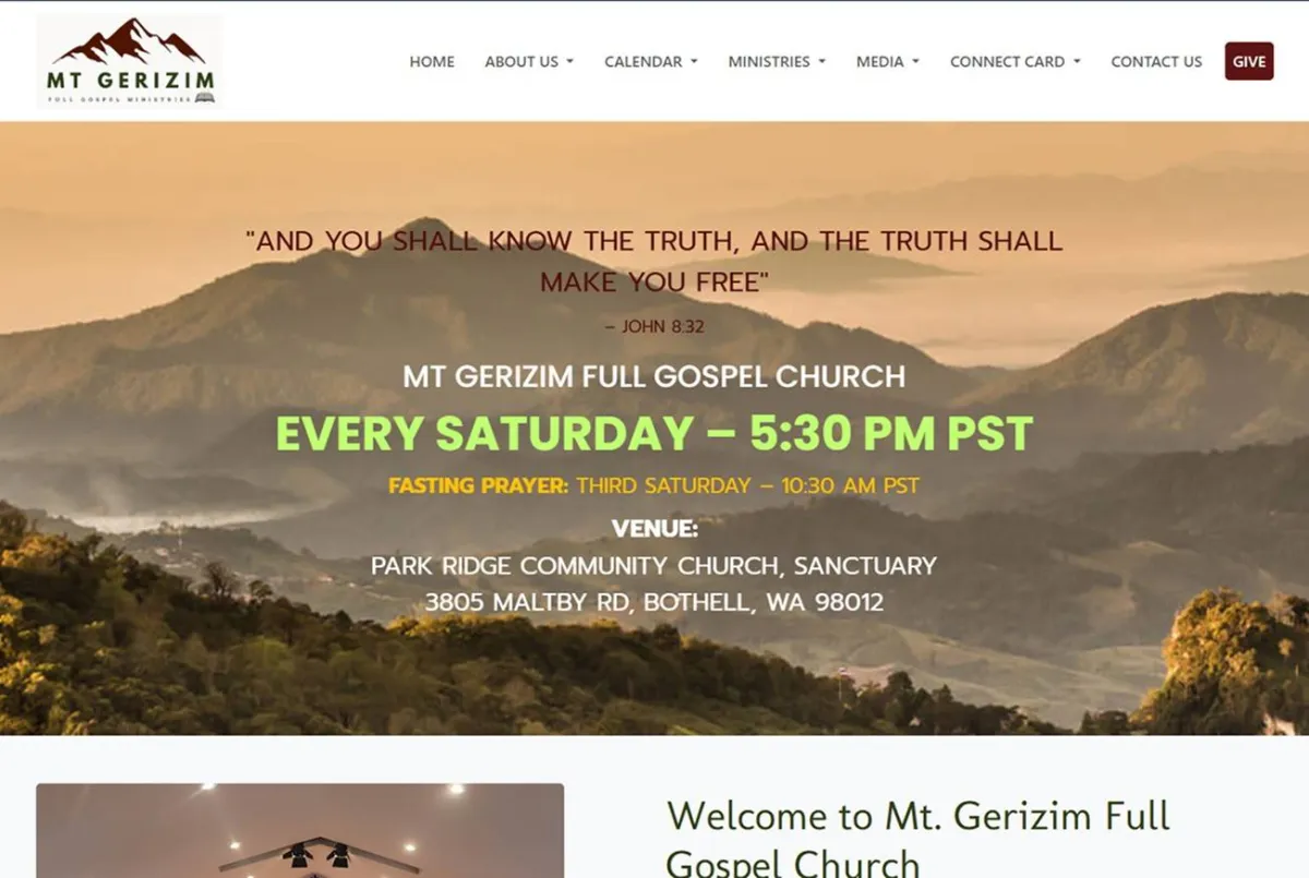
Mt Gerizim Ministries website
5Ministry pages
5Sign-up routes
8Navigation sections
2Founding milestones published
ChurchMinistry PagesCalendar and EventsOnline GivingSign-Up FormsLivestream Integration

Mt Gerizim Ministries — A Complete Church Website for a Newly Planted Congregation

The Challenge

  • The congregation meets inside another church’s building, so the location, day and time had to be unmistakable.
  • Services fall in the afternoon, not the conventional morning slot, and visitors assume wrongly unless a site says so.
  • The plant had no track record, so credibility had to come from the pastor’s background.
  • Baptism, child dedication and counselling requests needed structured sign-up routes.
  • Online giving had to work from the outset, since a collection alone cannot fund a plant.

What We Did

  • We designed a warm, welcoming visual system and gave the service times and the Park Ridge address visual prominence.
  • We built an About Us section carrying the 2023 beginnings, the 2025 registration and the pastor’s Master of Divinity and fifteen years in IT.
  • We built a Ministries section for children, youth, corporate prayer, monthly fasting prayer, and counselling and inner healing, plus a Calendar.
  • We added a Connect Card route and dedicated sign-up routes for baptism, child dedication, counselling and prayer requests.
  • We placed a Give route in the main navigation and a Media section of sermons, livestreams and gallery content.
  • We structured local SEO around Pentecostal church and church in Bothell intent, and handed over content management.

Built With

PHPBootstrapOnline GivingLivestream EmbedCalendar ModuleSign-Up Forms
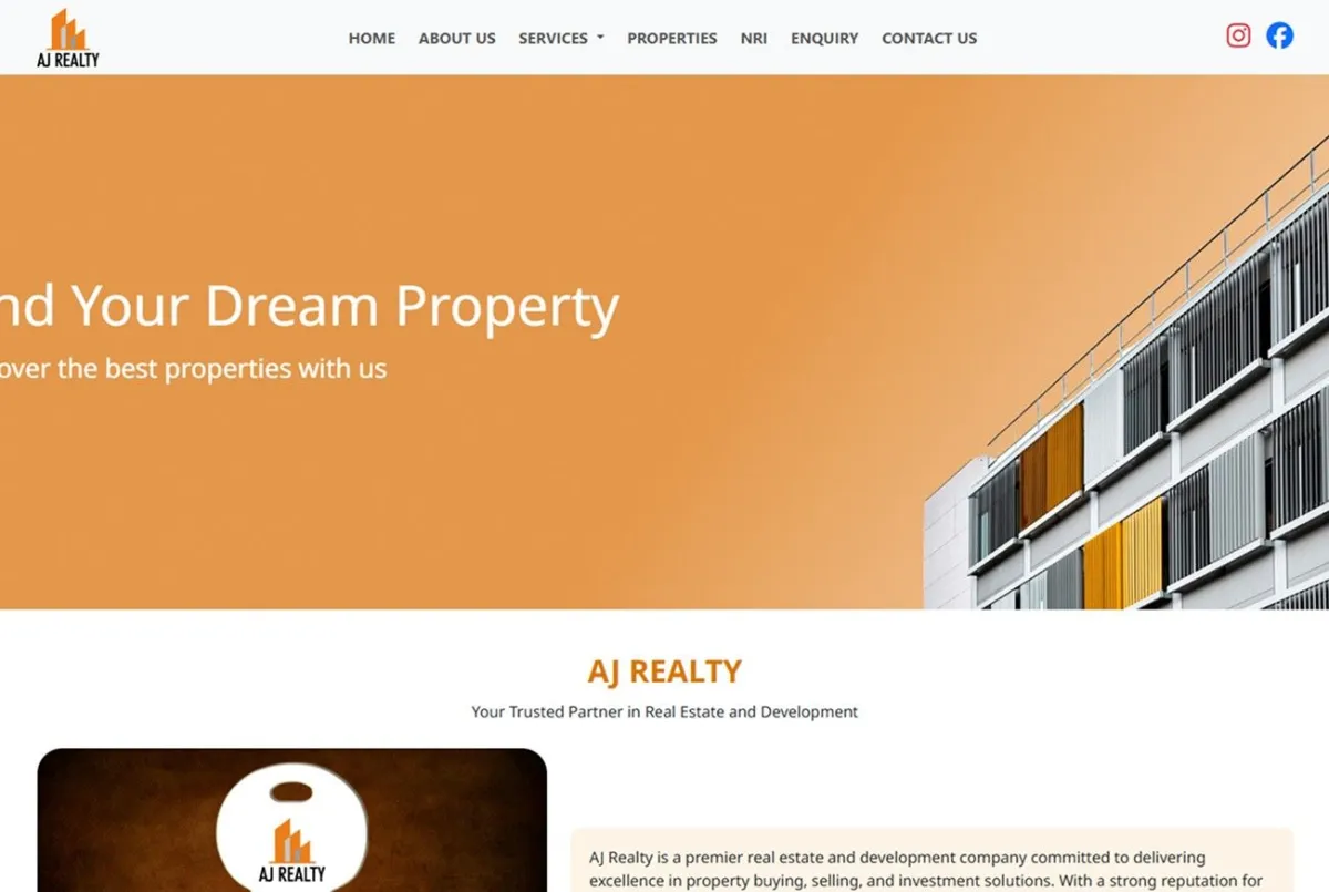
AJ Realty India website
3Property types
7Localities named
4NRI services published
6Advisory services
Real Estate BrokerageProperty Listings and SearchNRI DeskConsultation FunnelLocal SEO

AJ Realty India — A Property Discovery Website Built for Buyers and NRI Investors

The Challenge

  • Land, apartments and villas are three different purchase decisions, and one mixed listing page would serve none of them well.
  • Buyers filter by locality and budget first, so search had to be structural rather than a photo wall.
  • NRI investors need clear answers on Power of Attorney, FEMA compliance and remote verification.
  • An overseas buyer cannot walk the plot, so the site had to present the video call site visit as a real service.
  • Property enquiries move fast, so a consultation route had to sit on every page.

What We Did

  • We led the homepage with a property search panel filtering by type, location and budget, with featured listings beneath.
  • We split the navigation into Land, Apartment and Villa, and named the firm’s seven core localities across the site.
  • We gave overseas investors their own NRI route covering Power of Attorney support, FEMA guidance, video call site visits and weekly updates.
  • We separated the Services section into buying, selling, joint ventures, construction, interiors and property management.
  • We added testimonials, an FAQ section and a Book Consultation action with the 24 hour response commitment beside it.
  • We handed over a content system so the team publishes listings and marks properties sold without a developer.

Built With

PHPMySQLProperty Search FiltersListing TemplatesWhatsApp IntegrationGoogle Maps
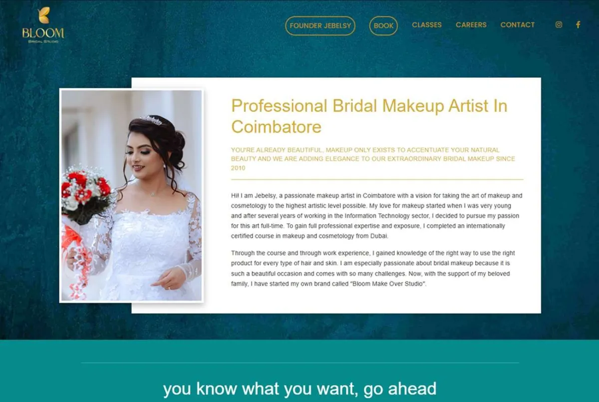
Bloom Bridal Studio website
5Services published
6Client reviews on site
3,000+Clients since 2010
3Audience routes
Bridal BeautyPortfolio GalleryBooking FunnelClasses PageCareers PageLocal SEO

Bloom Bridal Studio — A Booking-Led Website for a Bridal Makeup Studio

The Challenge

  • The founder is the product, so the site had to build around Jebelsy rather than a generic studio identity.
  • Brides judge a portfolio before anything else, so the photography needed real space, not a thumbnail strip.
  • The makeup classes serve aspiring artists, a completely different audience, and needed their own route.
  • Wedding bookings depend on a date, so an availability conversation matters more than a slow contact form.
  • Social proof decides this market, and the reviews sat on a third-party platform rather than the studio’s own site.

What We Did

  • We designed an elegant, feminine visual system where bridal photography carries every page, led by the studio’s philosophy line.
  • We gave Jebelsy her own route in the main navigation and published the 2010 founding and the 3,000 client figure.
  • We structured the five services around the wedding sequence and built a portfolio gallery sized so a bride can assess the work.
  • We placed a Book route in the main navigation and enabled WhatsApp, which is how brides actually check a date.
  • We published six featured client reviews on the studio’s own domain and gave the training arm a dedicated Classes route.
  • We published the hours and the Gandhipuram address with the Kalyan Jewellers landmark, and linked Instagram and Facebook.

Built With

PHPBootstrapPortfolio GalleryWhatsApp IntegrationLocal SEO
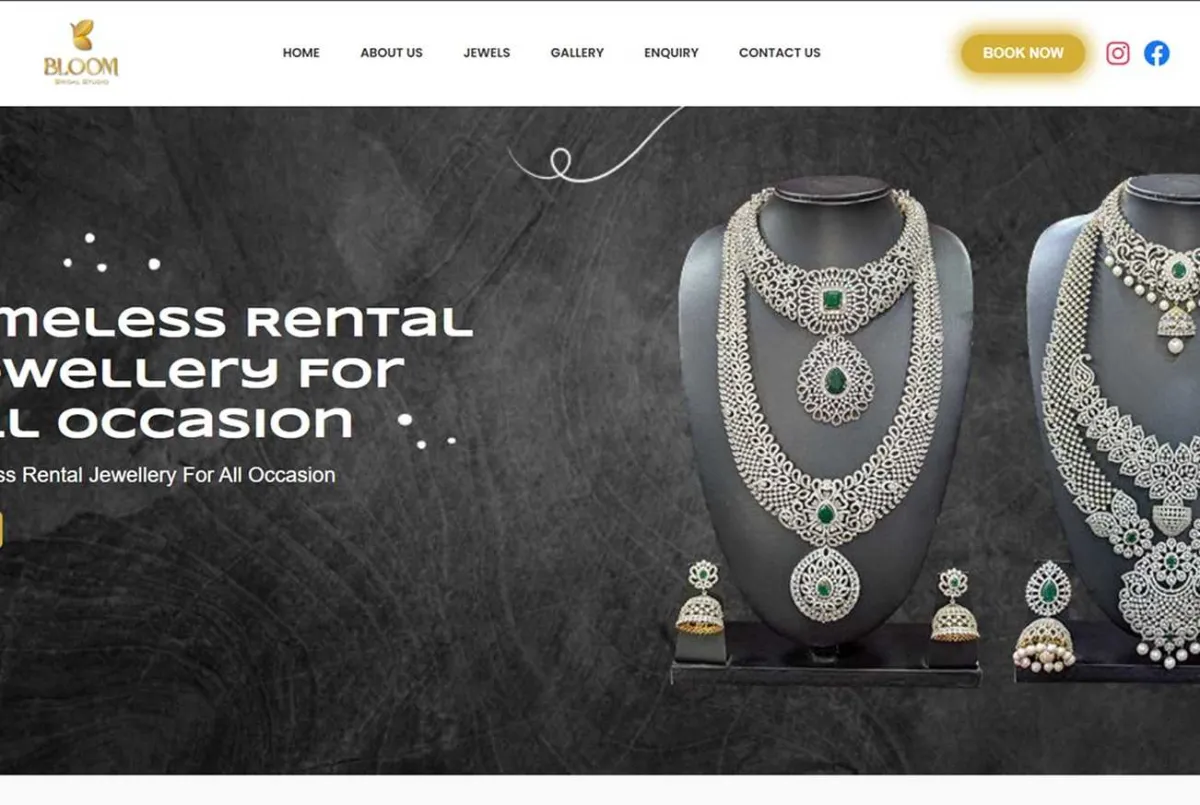
Bloom Wedding Collection website
15Jewellery categories
6Occasions covered
2Quality checks per piece
3Enquiry routes
Bridal Jewellery RentalProduct CatalogueCategory ArchitectureGallery ModuleEnquiry FormsCMS

Bloom Wedding Collection — Bringing a Rental Jewellery Collection Online

The Challenge

  • A large, varied inventory ranges from heavy temple sets to lightweight imitation pieces, and nothing organised it.
  • Rental needed explaining, because a first-time visitor assumes a jewellery site only sells.
  • Photography decides this category, so the site had to carry large images without turning slow on mobile data.
  • Out of town and NRI clients could not start a consultation remotely, even though the business already offered one.
  • Quality checks, service hours and honest pricing never appeared online, so the trust signals stayed invisible.

What We Did

  • We built the visual language around timeless rental jewellery with a warm bridal palette, so gold, kemp and stone tones read accurately.
  • We structured the inventory into fifteen named categories, each with its own landing page and a plain descriptive line.
  • We surfaced the quality check before and after every rental and told the story of a business trading since 2012.
  • We placed a persistent Book Now action that opens a WhatsApp conversation, plus a structured Enquiry page.
  • We positioned the online consultation and delivery offer clearly, giving out of town clients a defined next step.
  • We delivered an admin path for collection images, so the team updates the catalogue themselves.

Built With

PHPBootstrapCategory PagesGallery ModuleWhatsApp IntegrationCMS
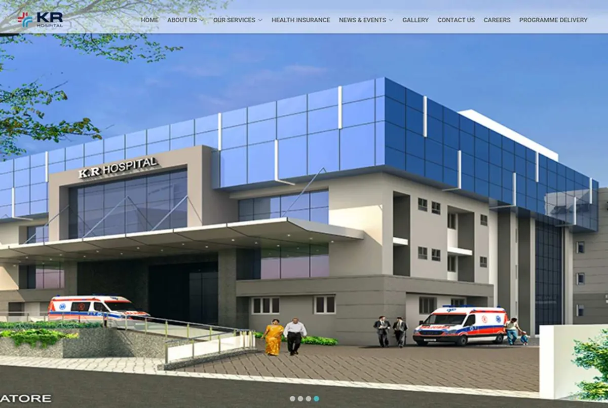
KR Hospital website
5xAppointment bookings
14Clinical areas listed
7Health check programmes
30+Insurance partners listed
HealthcareDepartment ArchitectureDoctor DirectoryHealth Check PackagesInsurance ListingCMS

KR Hospital — A 300-Bed Multi-Specialty Hospital Given a Structured Digital Front Door

The Challenge

  • A large department structure and a long consultant panel had no organised presentation, so patients could not tell whether the hospital treated their condition.
  • The site published no consultant credentials or special interests, and those decide which hospital a patient chooses.
  • A patient needed the emergency, ambulance and MRI numbers in seconds on a phone.
  • The long insurance panel was a real advantage, yet it stayed invisible to patients checking for cashless treatment.
  • The site had to serve patients, referring practitioners, insurance holders, job seekers and the local community at once.

What We Did

  • We designed a calm, clinical interface with a larger base type size, led by the hospital’s 1987 founding and 300 beds.
  • We created a Departments section giving every speciality its own entry, from cardiology to anaesthesia and poison care.
  • We built a consultant directory with name, qualifications, designation, background and areas of special interest for each doctor.
  • We published all seven health check programmes and a Health Insurance page listing every empanelled insurer, TPA and government scheme.
  • We made the two hospital lines and the MRI appointment number click to call, with WhatsApp and an embedded map beside them.
  • We delivered the site with an administrative back end, so staff publish news and add consultants in house.

Built With

PHPMySQLBootstrapDoctor DirectoryWhatsApp IntegrationLocal SEO Schema
“The online appointment system and doctor profile pages made a huge difference for our patients. We now rank on the first page of Google for hospital searches in Coimbatore. Excellent team.”— Administrator, KR Hospital
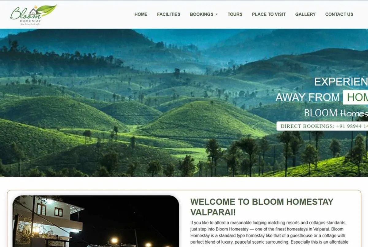
Bloom Home Stay website
3Room pages
12Guests total occupancy
6Facilities listed
4Booking channels
Homestay and TourismRoom and Booking PagesTours ModuleBlogGallerySEO

Bloom Home Stay — A Direct-Booking Website for a Valparai Hill Homestay

The Challenge

  • Three room types needed separate pages, because a family of six and a couple decide differently.
  • Guests pick Valparai for wildlife and scenery, so the site had to sell the destination alongside the property.
  • Platform listings capture most hill station search traffic, so the site needed strong destination-led visibility.
  • Trust blocks direct booking, so the property has to replace platform guarantees with reviews.
  • Practical details carry extra weight in a remote hill town: check-in times, parking, doctor on call and Wi-Fi.

What We Did

  • We designed a warm, natural visual system from the property’s own photography, led by the "Experience Away From Home" line.
  • We built a Bookings menu with one page each for the Family Suite and both Deluxe Suites, with occupancy and a Book Now action on each.
  • We listed home cooking, camp fire, doctor on call, tourist guide, free Wi-Fi and parking, with check-in and check-out times published.
  • We built Place to Visit, Tours and wildlife content on elephants, big cats, deer, bison and hornbills, plus a Blog for destination visibility.
  • We surfaced Google reviews with a link to the full set and enabled WhatsApp and tap-to-call on the published number.
  • We handed over a content system so the owners update tariffs and add blog posts without a developer.

Built With

PHPBootstrapBlog ModuleGalleryWhatsApp IntegrationGoogle Reviews
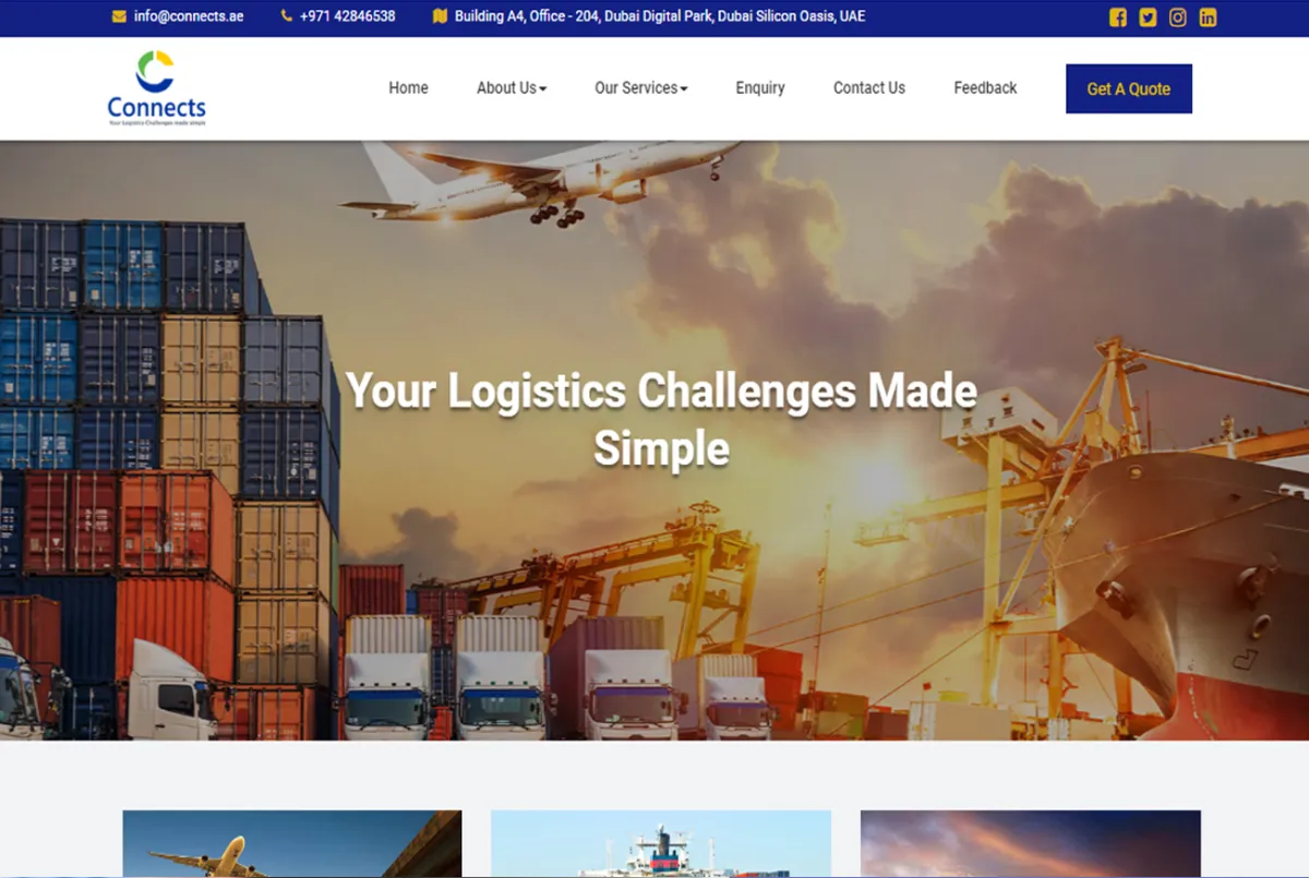
Connects FZE website
7Services published
10Industries named
500+Ports in network
160Countries reached
3PL and Contract LogisticsService PagesIndustry PagesQuote and Tracking StructureSEO

Connects FZE — A 3PL Logistics Platform for a Jebel Ali Free Zone Operator

The Challenge

  • Seven services serve very different buyers, so one services page would blur them together.
  • Buyers purchase 3PL and warehousing as recurring contracts, on completely different terms from freight rates.
  • Ten industries judge logistics differently, so the site had to address a healthcare shipper and a fashion brand at once.
  • Customers use a logistics site for shipment visibility, so tracking could not be an afterthought.
  • Jebel Ali Free Zone status is a real advantage for cross-border trade, and it was hiding inside an address line.

What We Did

  • We designed a clean, corporate visual system carrying the "Your Logistics Challenges Made Simple" positioning in the first screen.
  • We built an Our Services menu with pages for air, sea and road freight, drop shipping and warehousing, each written to its own decision criteria.
  • We stated reach through the 500 plus ports and 160 countries figures and named all ten industries on the site.
  • We added a Why Connects section, a Vision and Mission page and published the Jebel Ali Free Zone location clearly.
  • We placed an Enquiry route with a quote form and a Track Your Package route in the main navigation, separating Feedback from sales.
  • We enabled WhatsApp beside the form and linked Facebook, Instagram, LinkedIn and X.

Built With

PHPBootstrapQuote FormsTracking RouteWhatsApp IntegrationCMS
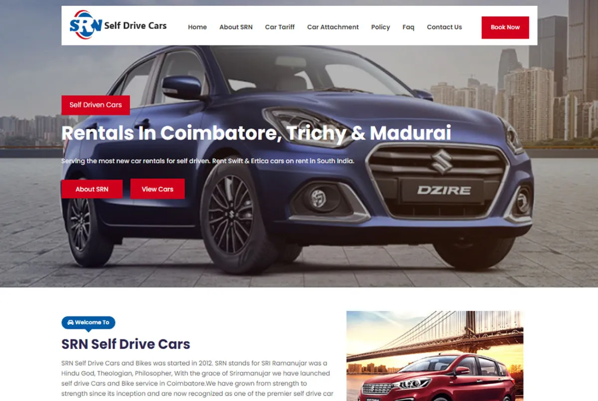
SRN Self Drive Cars website
4Vehicles published
3Cities named
24/7Availability published
4Booking channels
Car RentalTariff PagesPolicy and FAQBooking FunnelLocal SEO

SRN Self Drive Cars — A Booking-Focused Website for a Multi-City Self Drive Car Rental

The Challenge

  • Four vehicles serve different trips, from a city run to a family holiday, and each needed a tariff beside it.
  • Price is the first question, and gating it behind an enquiry hands the customer to whoever publishes a rate.
  • Rental disputes start in the policy, so documents, deposit, fuel and damage terms needed publishing upfront.
  • Customers often book minutes before pickup, which makes tap-to-call and WhatsApp more useful than a form.
  • Unlimited kilometres and FASTag are real differentiators, and a customer should not discover them at the counter.

What We Did

  • We designed a clean, practical visual system on vehicle photography, with a four-step process graphic: sign up, book, drive and return.
  • We gave pricing its own Car Tariff route and presented the Swift, Ertiga, Jetta and Honda City individually.
  • We stated the unlimited kilometres benefit on bookings of four days and longer, and the FASTag provision.
  • We wrote a dedicated Policy page and an FAQ section, with named customer testimonials from the cities the company serves.
  • We carried a Book Now action prominently, enabled tap-to-call and WhatsApp, and named Coimbatore, Trichy and Madurai explicitly.
  • We presented airport pickup as a named service and embedded a map at the Sivanandha Colony address.

Built With

PHPBootstrapTariff PagesWhatsApp IntegrationGoogle MapsLocal SEO
First Love Calvary Church website
5About pages
4Ministry pages
3Gatherings with times
2Contact forms
ChurchMinistry PagesEvents ModuleOnline GivingPrayer Request SystemSermon Library

First Love Calvary Church — A Complete Church Website for a London Congregation

The Challenge

  • Visitors look for service times first, so all three gatherings had to be visible at once.
  • The church meets at a different venue during maintenance, so the current location could not sit buried.
  • A visiting family often decides on the children’s ministry, so that programme needed its own page.
  • People choosing a church read doctrine closely, so the statement of faith and the vision needed proper space.
  • Sermons and testimonies keep a congregation engaged between Sundays, and had no home.

What We Did

  • We designed a warm, welcoming visual system and placed service times and the Woodgrange Baptist Church Hall venue high on the page.
  • We split About Us into About the Church, About the Pastor, Our Vision and Mission, Statement of Faith and Salvation.
  • We built a Ministries group of FLCC Pathfinders, Evangelism, Community Service and Sermon, with the four to sixteen age range stated.
  • We published an Events section with a shareable page per event, including the annual FLCC Conference, and a Testimony section.
  • We placed a Donation route in the main navigation and split Contact into Prayer Request and Connect with Us.
  • We added a Gallery of church life and handed over content management for events, sermons and service times.

Built With

PHPBootstrapSermon LibraryOnline GivingEvents ModulePrayer Request Forms
Vimal Jyothi School website
27Pages delivered
10Menu groups
10Infrastructure pages
7,250+Library volumes stated
Matriculation SchoolInformation ArchitecturePhoto GalleryCareers PageParent Portal IntegrationSEO

Vimal Jyothi School — A Digital Campus for a Forty Year Old Convent School

The Challenge

  • The school held no single source of information, so enquiries arrived by telephone and referral.
  • Office documents held the admission procedure and rules, so staff repeated one explanation for every parent.
  • Four laboratories, the library, the auditorium, the playground and the transport fleet stayed invisible to parents.
  • Competitions, sports and social service work ran continuously with nowhere to publish them, so the school looked static.
  • Parents already used an external management portal, with no branded entry point to reach it.

What We Did

  • We designed a calm academic visual language around the school’s own colour identity and real campus photography.
  • We mapped the content into 27 pages under ten menu groups: School, Infrastructure, Admission, Activities, Alumni, Gallery, Careers and Contact.
  • We built an Infrastructure group of ten pages, including the Physics, Chemistry, Biology and Computer laboratories.
  • We split Admission into Procedure and Rules and Regulations, each on a clean, shareable URL.
  • We placed a Parent Portal item in the top navigation and enabled click to call on mobile.
  • We built the site in PHP with clean URLs and per page titles, collapsing the ten group navigation into a usable mobile menu.

Built With

PHPBootstrapPhoto GalleryParent Portal LinkImage Optimisation
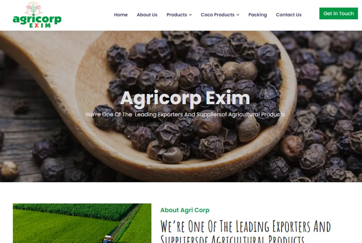
Agricorp Exim website
4Buyer types addressed
4Export stages published
4Enquiry fields captured
3Enquiry channels
Agricultural ExportProduct PagesExport Credential PresentationBuyer Enquiry FunnelSEO

Agricorp Exim — An Export Website for an Agricultural Commodity Exporter

The Challenge

  • Commodity buyers search by product, so each commodity needed its own address rather than a line on one products page.
  • Buyers qualify a supplier on documentation and export capability before they discuss price, so credentials needed prominence.
  • International buyers arrive with no prior knowledge of the business, which puts the whole credibility burden on the website.
  • The volume of near-identical competitors meant the site had to look professional within seconds.
  • Harvests set the trading calendar, so the business needed a way to announce availability as seasons turn.

What We Did

  • We designed a clean, professional visual system on product photography, avoiding the cluttered layouts common to Indian export sites.
  • We gave every product its own page and clean URL, structured around description, application and available forms.
  • We presented export capability in the terms an importer recognises: sourcing, grading, packing and shipment.
  • We published documentation and compliance capability as part of the offer, with a gallery of products, packing and handling.
  • We designed the enquiry route for a request for quotation, capturing commodity, grade, volume and destination port.
  • We enabled WhatsApp enquiry and handed over content management, so the team updates availability as seasons change.

Built With

PHPBootstrapProduct TemplatesQuotation FormsWhatsApp Integration
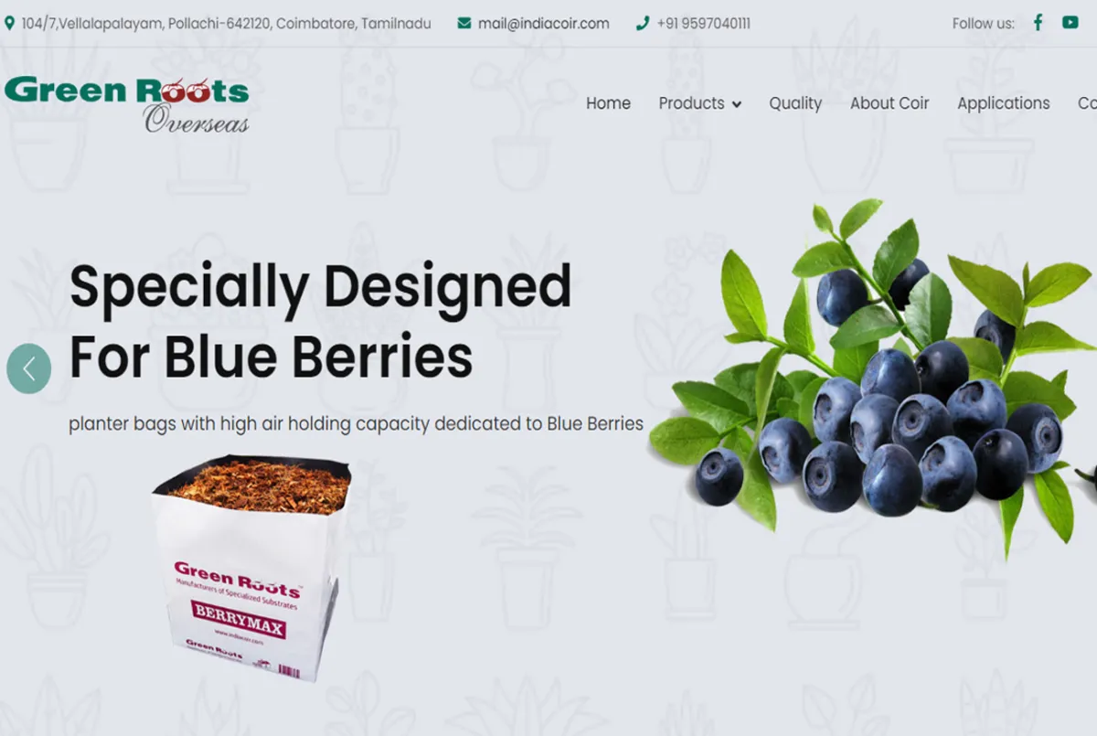
India Coir (Coirmedia) website
11Crop pages
5Format pages
14Export markets named
20+Years of R&D
Coir SubstratesCrop and Format Product ArchitectureQuality PagesCatalogue DownloadsNews ModuleSEO

India Coir (Coirmedia) — A Crop-Led Product Website for an International Coir Substrate Manufacturer

The Challenge

  • Growers search by crop, strawberry substrate or tomato grow bag, so a format-only catalogue would miss them.
  • One physical product serves several crops, and one crop suits several formats, so the catalogue needed two intersecting axes.
  • Fourteen named markets bring different regulatory, language and buying expectations, and needed visibility as export proof.
  • Growers buy propagation products on washing and consistency, so quality needed a section, not a claim.
  • A London base with Indian and Sri Lankan manufacturing had to read as supply strength, not as a split identity.

What We Did

  • We designed a clean agricultural visual system led by crop photography, carrying the "Seeding the Success" line.
  • We organised the Products menu into four routes: Soft fruit crops, Vegetable crops, Format and Customized, with a page per crop and format.
  • We built a Quality section stating triple washed propagation products and more than 20 years of research and development.
  • We listed fourteen named countries with country-specific pages and surfaced the rural women’s employment initiative.
  • We published catalogue and specification downloads, a News section and a Get in Touch form around crop, format and volume.
  • We enabled WhatsApp contact, newsletter subscription and an embedded Instagram feed.

Built With

PHPBootstrapTwo-Axis CatalogueCountry PagesPDF DownloadsWhatsApp Integration
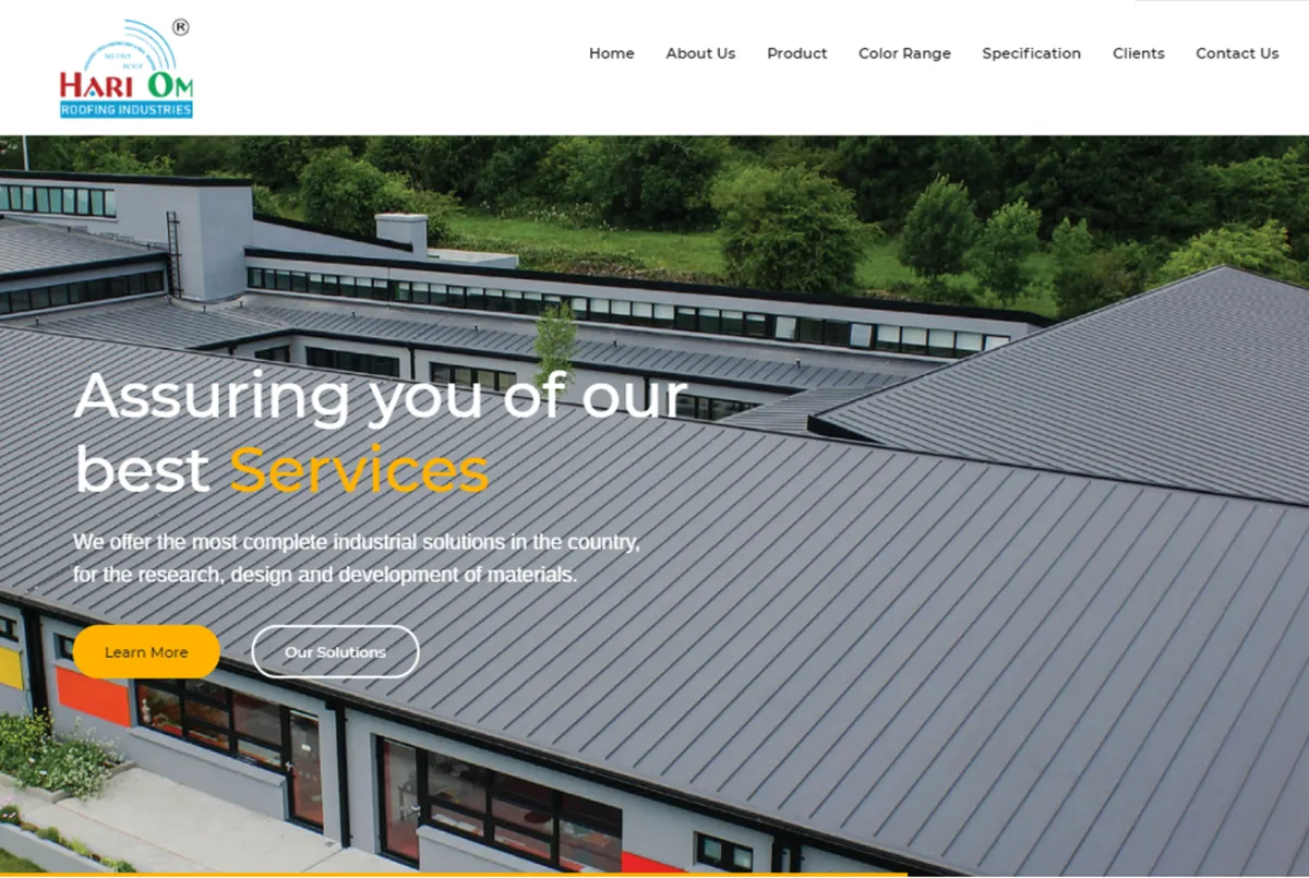
Hari Om Roofing website
5Product lines
4Standards published
4Manufacturing units
20+Years in industry
Roofing SystemsProduct PagesColour RangeSpecification SectionQuote FunnelLocal SEO

Hari Om Roofing — A Specification-Led Website for a Roofing and Pre-Engineered Building Manufacturer

The Challenge

  • Five product lines cover sheeting, purlins, decking, ventilation and daylighting, so each needed its own page.
  • Colour selection is a real decision stage in roofing, and a colour range needs showing visually rather than describing.
  • Gauge, coating, profile and standards qualify a product, so buyers had to reach that detail without asking.
  • Larger projects demand ASTM, JIS, AS and IS compliance, so those standards needed prominence for procurement teams.
  • Contractors enquire from site with a measurement and a deadline, so the quote route had to work first on mobile.

What We Did

  • We designed a strong industrial visual system on real roofing photography, with a carousel carrying the "Smart Roofing Solution" line.
  • We built a Products section presenting GalValume sheets, C and Z purlins, decking sheets, turbo roof ventilators and polycarbonate sheets individually.
  • We added a Colour Range section and a Specification section to the main navigation, where buyers go looking.
  • We stated ASTM, JIS, AS and IS compliance and displayed ISO certification where a project specifier looks for it.
  • We built Clients, testimonials from Coimbatore, Tirupur and Palghat, and a Recently Completed Works gallery.
  • We placed a Get A Quote action in the main navigation and enabled WhatsApp for measurements and site photographs.

Built With

PHPMySQLBootstrapQuote Request FormsWhatsApp IntegrationGeographic Metadata
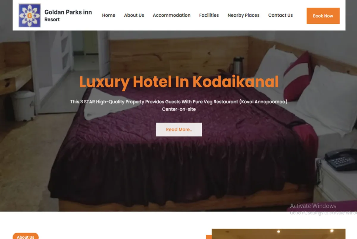
Kodai Goldan Parks Inn website
1Page per room category
4Practical questions answered
4Sightseeing draws covered
3Direct booking routes
Hill Station HotelRoom and Tariff PagesFacilities SectionDestination ContentGallerySEO

Kodai Goldan Parks Inn — A Direct-Booking Website for a Kodaikanal Hill Station Hotel

The Challenge

  • Aggregator platforms dominate Kodaikanal search results, so the hotel needed to convert direct traffic itself.
  • A family comparing five hotels skips any property that hides its rates, so room categories needed clear tariffs.
  • Guests choose a destination as much as a hotel, so the site had to sell Kodaikanal alongside the property.
  • Last-minute weekend bookers act on the phone, so tap to call and messaging matter more than a booking engine.
  • Guests otherwise phone to ask about parking, hot water, dining and room heating, the practical concerns of a hill station stay.

What We Did

  • We designed a fresh, inviting visual system on the property’s own photography, with the Kodaikanal location established on the homepage.
  • We presented room categories individually with occupancy, configuration and published tariff information.
  • We built a facilities section covering dining, parking and in-room comfort, answering the questions guests would otherwise phone about.
  • We wrote destination content on the lake, the viewpoints, the falls and the surrounding hills, positioning the hotel as a base for a trip.
  • We enabled tap to call, WhatsApp for quick availability questions and an enquiry form for guests planning ahead.
  • We handed over content management for seasonal tariffs and the gallery.

Built With

PHPBootstrapRoom TemplatesGalleryWhatsApp IntegrationLocal SEO
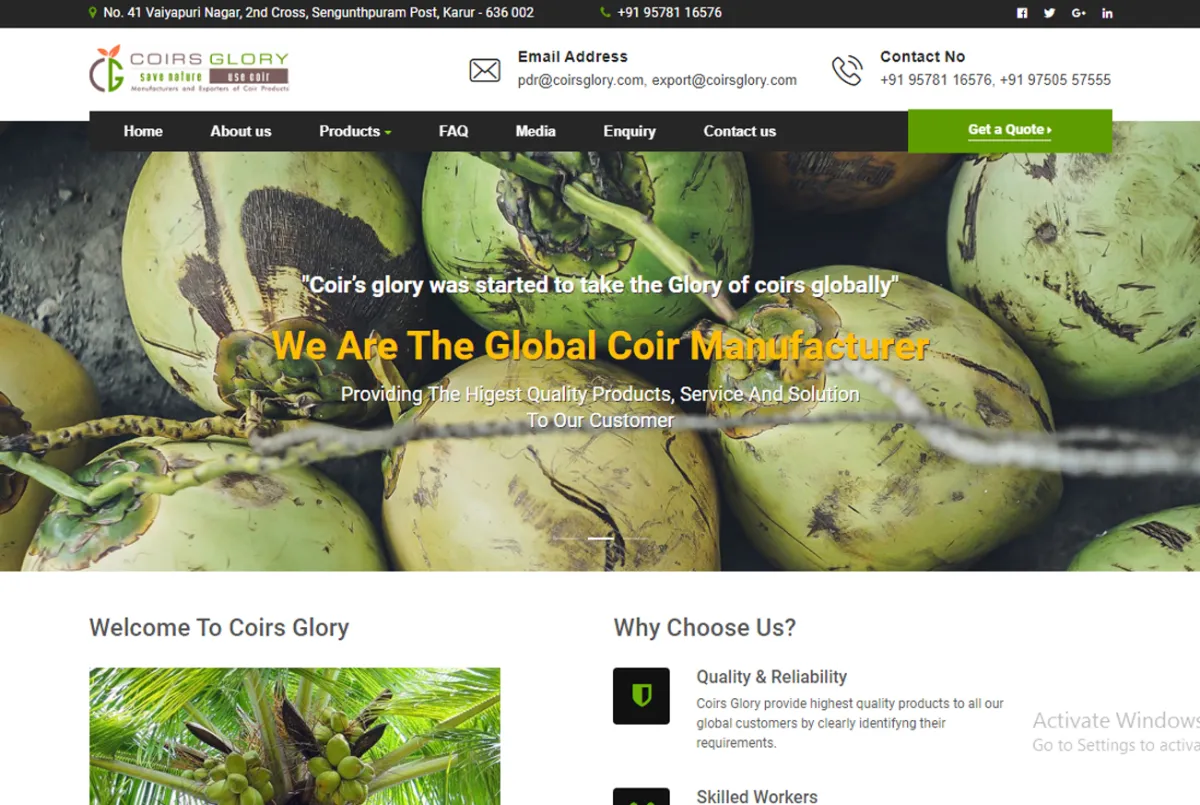
Coirs Glory website
5Product format pages
4Processing stages published
3Export regions named
3Enquiry channels
Coir ManufacturingProduct PagesExport Credential PresentationEnquiry FunnelSEO

Coirs Glory — A Product and Export Website for a Coir Manufacturer

The Challenge

  • Product formats serve genuinely different buyers, so one combined products page would have failed most of the demand.
  • Overseas buyers search by format, coco peat blocks or grow bags, so each format needed its own addressable page.
  • Specification consistency wins repeat business in this trade, so quality needed presenting rather than asserting.
  • Container utilisation affects a buyer’s landed cost, so they need to understand packing and loading capability.
  • The business needed a presence that did not depend on third-party marketplace listings.

What We Did

  • We designed a clean, product-led visual system, deliberately uncluttered, which sets the business apart from regional competitors.
  • We gave blocks, bricks, bales, grow bags and discs their own pages and clean URLs, with enquiry actions on each.
  • We presented manufacturing capability in terms buyers recognise: processing, washing, drying and compression.
  • We gave packing and loading capability real space and added a gallery of products, processing and packing.
  • We designed the enquiry route for sample and container-load requests, capturing format, volume and destination.
  • We enabled WhatsApp enquiry and published the location, since buyers assess freight distance to the loading port.

Built With

PHPBootstrapProduct TemplatesSample Request FormsWhatsApp Integration
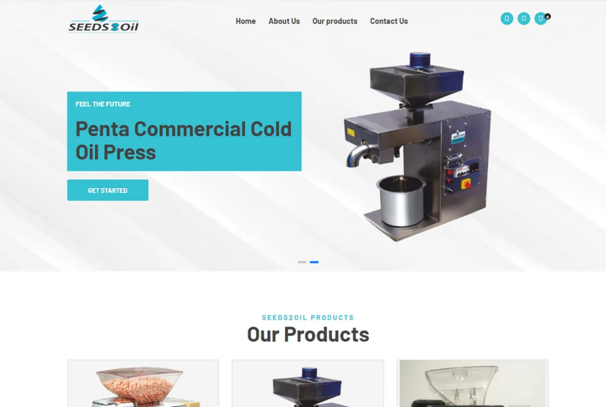
Seeds2Oil website
7Store areas delivered
2Machine ranges
5Client managed admin areas
4Buyer groups served
Food Processing MachineryE-Commerce StoreProduct CatalogueCart and CheckoutPayment and ShippingCustomer Accounts

Seeds2Oil — Taking a Cold Press Oil Machine Brand Into Direct Online Selling

The Challenge

  • No store of its own left the brand leaning on third party listings and phone calls.
  • A first time buyer has to learn what a cold press machine does before price matters.
  • Machine sizes run from home use to commercial use, and nothing helped a visitor match a model to their volume.
  • A machine ships heavier and costs more than a retail parcel, so delivery terms needed stating before checkout.
  • The client wanted to change products, prices and stock without calling a developer each time.

What We Did

  • We designed a product first home page naming what the brand makes and where it makes it, with machines given visual prominence.
  • We structured the catalogue by machine type, separating household scale models from commercial oil presses, with a page per machine.
  • We added a products information page that introduces cold pressing to a visitor who is not ready for a product page.
  • We implemented a persistent cart, a one path checkout, payment methods and consistent shipping charges for a bulky machine.
  • We published a delivery information page and added customer accounts, so repeat buyers reorder and track history.
  • We set up an administration area where the client manages products, categories, prices, stock and images.

Built With

E-Commerce PlatformShopping CartPayment GatewayShipping ConfigurationCustomer AccountsAdmin Dashboard
Salzer Online website
2Catalogue segments
5Product categories
6Commerce features
5Factories shown
Electrical Products E-CommerceE-Commerce DevelopmentCatalogue ArchitectureCart and CheckoutCustomer AccountsAffiliate Programme

Salzer Online — An Online Store for an Electrical Manufacturing Group

The Challenge

  • A catalogue spanning switchgear, motor control, transformers, wires, cables, ducts and relays needed navigable category architecture.
  • Building trade customers and industrial buyers want different products, so the two segments needed separating at the top.
  • Buyers choose on specification, so product pages had to carry enough technical detail to prevent wrong orders.
  • Trade buyers reorder the same items, which makes accounts, order history and wish lists real requirements.
  • Counterfeit electrical goods are a genuine market problem, so the store had to prove it was the manufacturer’s own channel.

What We Did

  • We designed a clean, functional store that puts product findability ahead of visual flourish.
  • We split the top of the catalogue into Building Segment and Industrial Segment, with categories across motor control, transformers, wires and cables, cable ducts and relays.
  • We built a cart, registration and login, order history, a wish list and gift certificates, tested on a phone.
  • We built a Specials section, newsletter signup and an affiliate programme, giving trade customers reasons to return.
  • We published a Quality Policy and Service section and carried the 1985 founding and five factories throughout.
  • We handed over catalogue management, so the Salzer team adds products, edits categories and runs specials alone.

Built With

E-Commerce PlatformCustomer AccountsWish ListAffiliate ModuleNewsletterSecure Checkout
Connects Cart website
9Top level categories
7Stationery brands carried
2Regional storefronts
3Payment methods
Multi-Category RetailShopify Store BuildCategory ArchitectureMulti-Region StorefrontPayment and Delivery SetupSEO

Connects Cart — A Multi-Category Online Store for a UAE Trading Business

The Challenge

  • Nine top-level categories across fashion, kids, home, grocery and office supplies needed structure a new visitor could follow.
  • Christmas, winter sales and back to school peak at different times, so seasonal merchandising needed no quarterly rebuild.
  • The India storefront had to run beside the UAE store without duplicating the catalogue or confusing customers.
  • Stationery brands carry real purchase intent, so brand-led browsing had to sit beside category-led browsing.
  • Same-day delivery is the competitive promise, so it had to show everywhere, not only at checkout.

What We Did

  • We designed a bright, commercial store with nine top-level categories, a Trending route and a Brands route running in parallel.
  • We built a collection structure for Christmas Collections, Christmas Combo Offers, Winter Sales and New Arrivals.
  • We configured cash on delivery, PayPal and card payment, promo codes, and surfaced free shipping and same-day delivery across the store.
  • We set up a separate India storefront and supported English and Arabic for the home market.
  • We made the Connects logistics link visible, added customer accounts and linked Instagram, Facebook, YouTube and TikTok.
  • We built on Shopify with reworked theme and templates, and handed over catalogue and collection management.

Built With

ShopifyCustom ThemeCash on DeliveryPayPalMulti-Region StorefrontPromo Codes
PSG Coirs website
5Product formats
4Buyer segments addressed
5Enquiry routes
2005Founding year published
Coir ManufacturingProduct CatalogueEnquiry SystemNews ModuleSEO

PSG Coirs — An Export Product Website for a Pollachi Coco Peat Manufacturer

The Challenge

  • Five product formats, blocks, bricks, grow bags, weed mats, and discs and coins, serve different growers and needed individual presentation.
  • Export buyers judge a supplier from the website before requesting a sample, so presentation carried commercial weight.
  • Dozens of small coir exporters work in Pollachi, so PSG Coirs had to differentiate on credibility rather than price.
  • The founder’s Dutch technical grounding is a real trust asset for European buyers, and had nowhere to sit.
  • Enquiries arrive from overseas as sample and container-load requests, so the enquiry route had to suit them.

What We Did

  • We built a product led visual system with a homepage carousel from the company’s own product and facility imagery.
  • We structured the Products menu by format, naming the 5 kg block weight, since block weight is a purchasing specification.
  • We wrote an About Us section carrying the 2005 founding, the founder’s name and the Dutch knowledge transfer.
  • We added an Our Companies section for the associated businesses and three credibility badges with testimonials.
  • We put a dedicated Enquiry route in the main navigation and published both mobile numbers and both email addresses.
  • We added a News section, so the company publishes trade fairs, new formats and capacity updates itself.

Built With

PHPBootstrapProduct TemplatesNews ModuleEnquiry FormsCMS
Shalom International Ministries website
2Devotional series
5Word Anchor steps built in
2Teaching formats
1On-site video library
Bible Teaching MinistryTeaching Content ArchitectureVideo LibraryDevotional SeriesEnquiry PathsSEO

Shalom International Ministries — A Teaching and Media Website for an International Christian Fellowship

The Challenge

  • Teaching is the main output, so the site had to work as a content platform, not a service-times noticeboard.
  • Living Bread Promises and Word Anchor each needed their own structure, so entries could accumulate over time.
  • Word Anchor’s five-step pattern is the method, so the interface had to show it rather than describe it.
  • Video teaching needed a proper home, because recorded messages keep a dispersed fellowship connected.
  • The ministry team needed to publish entries and videos themselves, without a developer in the loop.

What We Did

  • We designed a calm, uncluttered visual system with typography and line length tuned for reading devotional passages on a phone.
  • We gave Living Bread Promises and Word Anchor their own accumulating sections with consistent entry templates.
  • We mapped Word Anchor’s five steps, believe, confess, read, pray and relate, onto the page structure.
  • We built a dedicated video section with playback on the site, structured to stay navigable as recordings accumulate.
  • We published fellowship information across age groups and the week, and stated the ministry’s emphasis and multicultural composition plainly.
  • We added enquiry and contact routes and handed over content management for entries and videos.

Built With

PHPBootstrapVideo EmbeddingDevotional Entry TemplatesCMS
Shelter House website
7Top level routes
6Named programmes
4Resource library shelves
2Languages published
Church and CommunityMinistry and Community PagesSermon LibraryResource DownloadsGiving IntegrationSEO

Shelter House — A Resource-Rich Church Website for a Bengaluru Congregation

The Challenge

  • Two worship locations meant service information could not assume a single venue.
  • Six named programmes each carry their own identity and audience, so each needed a page of its own.
  • The resource output, sermons, notes, apps, books and a newsletter, needed a library, not a downloads page.
  • Tamil-speaking members needed material in their own language, without a separate site.
  • Youth content needed its own space, because a teenager will not read content written for their parents.

What We Did

  • We designed a clean, contemporary visual system carrying the Transformation, Generation, Nations theme, with the latest sermon embedded on the homepage.
  • We built a Services route covering the Arekere Worship Sanctuary and Canaan Farm View, and split Our Story into Vision and Our Pastor.
  • We built a Community route with a page for Green Pastures, Revive India, My Time, Hesed and Something Beautiful, plus a separate YLM For Jesus route.
  • We structured Resources as a library across Sermons, Sermon Notes, Apps and Books, and the Tuvia newsletter, with Tamil and English material inside.
  • We built a Jesus Story route of four pages for seekers and split Reach Us into Contact and Contribute.
  • We hosted PDFs across the whole archive and handed over content management for sermons, notes and programme updates.

Built With

PHPBootstrapVideo EmbeddingPDF ArchiveGiving IntegrationCMS
Hotel Mangala Towers website
5Room categories
1,000Banquet hall capacity
4Named function halls
5Contact routes
Business HotelRoom and Tariff PagesDining and Banquet SectionsPhoto GalleryBooking PathsSEO

Hotel Mangala Towers — A Rooms, Dining and Banquets Website for a Thrissur Four Star Hotel

The Challenge

  • No structured room inventory meant a guest could not compare the five grades or see what each includes.
  • The banquet business sells on capacity and floor area, yet a wedding family or corporate organiser had no online reference.
  • Two very different buyers needed serving at once, the room guest and the local event client.
  • Dining was invisible online, though Treat Restaurant and the rooftop permit room draw local footfall.
  • Location is arguably the strongest asset, and it sat in an address block instead of selling the booking.

What We Did

  • We designed a hospitality led layout with large photography and a persistent Book Now action in the main navigation.
  • We built a tariff page presenting Deluxe, Luxury, Premier, Executive and Suite as cards, each with amenities and a booking action.
  • We built the banquets page around the 1,000 person banquet hall, the 200 person conference hall and the four Celebrate halls with floor areas.
  • We gave Treat Restaurant a dining section carrying the cuisine mix, meal timings and the rooftop permit room.
  • We published the landline, two mobile numbers and two email addresses, with click to call on mobile.
  • We wrote titles and headings around category and city, so the site competes on Thrissur hotel and banquet hall searches.

Built With

PHPBootstrapServer-side FormsPhoto GalleryImage Optimisation
CSI Bishop Appasamy College website
40+Majors across 3 levels
8Departments presented
3Compliance routes
20,000+Graduates stated
Higher EducationProgramme ArchitectureAdmissions FunnelCompliance PagesPlacement and AlumniSEO

CSI Bishop Appasamy College — A Full Institutional Website for a Thirty-Year-Old Arts and Science College

The Challenge

  • More than 40 programmes needed a structure that takes a student to their own course quickly.
  • Regulators expect proper pages for IQAC, grievance redressal, mandatory disclosure and institutional rules.
  • The admissions cycle drives seasonal traffic spikes, so the admissions route had to be unmissable.
  • Placement outcomes decide many family choices, so they needed evidence, not assertion.
  • Current students need circulars and exam news, which is a different job from prospectus content.

What We Did

  • We designed a dignified institutional visual system with a slider of campus and departments and an achievements band.
  • We split Courses into UG, PG and Research Programmes, gave each of the eight departments its own presentation and published Faculty Profiles.
  • We placed the Admissions route in both the top bar and the main navigation, with an online application and an e-Brochure download.
  • We put IQAC, Grievance and the e-Rules document where regulators and parents can find them, with NAAC and ISO 9001:2015 stated.
  • We built Placements with a Top Recruiters gallery and the IBM SkillsBuild partnership, plus Facilities, Activities and an Alumni route.
  • We placed Announcements and Recent Updates on the homepage and handed over content management to staff.

Built With

PHPMySQLBootstrapOnline ApplicationPDF HostingCMS
PWI Fastener website
1Page per fastener type
3Attributes per product
4Industries addressed
4Enquiry fields captured
Industrial FastenersProduct CatalogueSpecification PresentationEnquiry FunnelLocal SEO

PWI Fastener — An Industrial Catalogue Website for a Fastener Manufacturer

The Challenge

  • Fastener types are genuinely distinct products, and one combined products page would have made the range unsearchable.
  • Thread, material, finish and size range qualify a supplier, so the site had to publish that detail rather than promise it.
  • A volume buyer also judges manufacturing capability, because tolerance has to hold across a production run.
  • A dense local cluster meant the site had to win on professionalism rather than on price.
  • Purchase and maintenance staff enquire from a shop floor, which makes mobile access and direct calling practical needs.

What We Did

  • We designed a clean industrial visual system and named the business as a Coimbatore fastener manufacturer immediately.
  • We gave every fastener type its own page and clean URL, carrying size range, material and finish.
  • We wrote an about section that establishes the company as a manufacturer rather than a trader, with production capability in a purchase manager’s terms.
  • We listed pumps, motors, textile machinery and general engineering as industries served, with a gallery of products and production.
  • We structured the enquiry form to capture fastener type, size, material and quantity, so the first reply carries a usable quotation.
  • We repeated enquiry actions across product pages and published direct contact details anchored to Coimbatore.

Built With

PHPMySQLBootstrapProduct TemplatesEnquiry FormsLocal SEO
BioMedSciDirect Publications website
4Indexing databases
10Policy pages
40+Subject filters
4Issues per year
Academic PublishingJournal ArchiveOnline SubmissionDOI and Indexing IntegrationSearch SystemSEO

BioMedSciDirect Publications — Building and Maintaining a Scholarly Publishing Platform

The Challenge

  • DOAJ and Index Copernicus demand discoverable pages on ethics, peer review, licensing, charges and archiving, so compliance shaped the architecture.
  • A quarterly journal accumulates volumes forever, so the archive had to scale and stay navigable.
  • Every article needs a permanent citable address with a resolvable DOI, which demands a stable URL structure.
  • Authors and reviewers are separate constituencies, so each needed their own guidelines and registration route.
  • Readers arrive searching by discipline across more than 40 subject areas. That is a search problem, not a menu problem.

What We Did

  • We designed a clean academic visual system with typography tuned for long scientific text, and a seven action navigation.
  • We organised the Archives by volume and issue, published every article at a permanent address and integrated DOI assignment through CrossRef.
  • We built an advanced search with more than 40 subject filters, so a researcher searches by discipline.
  • We built an online submission system and grouped author resources: instructions, registration, copyright document, covering letter and charges.
  • We gave reviewers their own section and built an Editorial Board section covering the peer review and editorial process.
  • We published ten policy pages, named the Creative Commons licence explicitly and listed Google Scholar, DOAJ, CrossRef and Index Copernicus.

Built With

PHPMySQLCrossRef DOI IntegrationAdvanced SearchPDF ArchiveSecure Login
Coir ERP website
6Connected modules
4Production stages tracked
4Units of measure handled
4User roles
ERP SoftwareERP DevelopmentModule DesignDatabase ArchitectureRole Based AccessReporting Dashboards

Coir ERP — Building a Coir Industry ERP for Manufacturers and Exporters

The Challenge

  • Raw material arrives by weight and leaves by volume, block or bag, so the system had to convert units.
  • Coco peat and fibre carry moisture, electrical conductivity and pH readings that affect price, so each batch needed them.
  • Production runs through washing, drying, sieving and compression, so the system had to track work in progress.
  • Owners, accountants, supervisors and yard staff need different access, so role based control was essential.
  • Staff here are not office software users, so the interface had to be learnable in a morning.

What We Did

  • We designed a clean, high-contrast browser interface with one screen pattern repeated across modules, usable on office desktops and yard tablets.
  • We built Purchase, Production, Stock, Sales, Masters and Reporting modules that follow the material from purchase to despatch.
  • We modelled each production stage, so material stays visible as work in progress, and captured quality readings against batches.
  • We built a dashboard of stock, purchases, output and pending despatches, with stock, purchase, sales, production and outstanding reports that print or export.
  • We applied role based access for owner, accounts, production supervisor and data entry operator, with an audit trail on transactions.
  • We built it in PHP on CodeIgniter with MySQL and deployed it as a hosted application, with a live demonstration instance.

Built With

PHPCodeIgniterMySQLRole Based Access ControlReporting DashboardHosted Deployment
MIT Group UAE website
10+Product families
5Service pages
4Credentials surfaced
8Vendor brands named
IT and ERP ServicesInformation ArchitectureProduct and Service PagesCredential ShowcaseBlog and CMSSEO

MIT Group UAE — Structuring a Multi-Vendor IT and ERP Portfolio into a Navigable Corporate Website

The Challenge

  • More than ten product families and upwards of thirty named vendor brands outgrew a flat brochure structure.
  • Two very different buyers landed on one homepage, a finance owner asking about VAT and an IT manager asking about firewalls and CCTV.
  • Vendor authorisations were the business’s strongest trust asset, yet sat nowhere a buyer could scan them.
  • AMC work is scoped per environment, so the site had to qualify requirements, not publish prices.
  • The company had no mobile experience, and no way to publish content without a developer.

What We Did

  • We designed a clean corporate interface for finance and IT buyers, with a homepage that splits the audience into three pillars.
  • We grouped the catalogue into problem-led families such as ERP and Software, Email Security and DLP, Firewall and Network Security, with vendor brands nested beneath.
  • We kept recurring support work in its own Our Services branch: AMC, hardware support, software support, data recovery and Malaffi.
  • We built a Business Partners page gathering every vendor authorisation, and surfaced TallyPrime Gold Partner, certified Tally and VAT consultants, ADMCC approval and MCC certified integrator site-wide.
  • We wrote a homepage call to action offering a free UAE VAT and accounting system assessment, with landline, WhatsApp and email throughout.
  • We developed it on WordPress with a custom front end, so the client manages products, services, partners and blog posts.

Built With

WordPressCustom ThemeMulti Level NavigationBlogWhatsApp IntegrationGoogle Analytics
Hotel Mangala International website
85Rooms and suites
3Event spaces
300Banquet hall capacity
2Restaurants presented
Business HotelRoom and Tariff PagesDining and Banquet SectionsGalleryBooking PathsLocal SEO

Hotel Mangala International — A Rooms, Dining and Banquet Website for a Coimbatore Business Hotel

The Challenge

  • Rooms, dining and banqueting are three revenue streams, so each needed its own route.
  • Corporate event bookers check capacity first, so the site had to show the figures for all three spaces.
  • Tariff transparency turns a comparison visitor into a booking, especially in a competitive city centre market.
  • A central Coimbatore address and transport links decide many business trips, so location had to be explicit.
  • Aggregators compete for the same booking, so the site had to give a guest a reason to book direct.

What We Did

  • We designed a clean business-class visual system on the hotel’s own photography, with rooms, dining and banquets within reach of the first screen.
  • We presented the accommodation categories across the 85 rooms and suites with a published tariff section.
  • We built a banquets and events section publishing 300 in the banquet hall, 300 in the conference hall and 75 in the board room.
  • We wrote a dining section covering both restaurants, with the Kerala seafood speciality given real visibility.
  • We stated proximity to bus, taxi and rail connections and the airport, and published the Nehru Street address in full.
  • We opened enquiry and booking routes from every section and added testimonials to support direct booking.

Built With

PHPBootstrapRoom TemplatesGalleryEnquiry FormsLocal SEO
Paxton Consultants website
5Service lines separated
2Certifications surfaced
3Client tiers named
2Audience paths
IT Staffing and ConsultingService PagesCredential PresentationEnquiry FunnelSEO

Paxton Consultants — A Corporate Website for a US IT Staffing and Management Services Firm

The Challenge

  • Five service lines, from retained executive search to statement of work delivery, reach different buyers inside one client.
  • MWBE certification carries real procurement weight, because many corporate and public buyers hold diverse supplier spend targets.
  • Managed service provider and statement of work engagements are contracts, not placements, and needed presenting that way.
  • A New Jersey base with nationwide delivery needed stating, so out-of-state buyers did not assume a regional firm.
  • Candidates and clients arrive at the same website with entirely different needs.

What We Did

  • We designed a clean corporate visual system for a firm selling into Fortune 500 procurement, opened on the mission statement.
  • We separated executive and retained search, direct hire, MSP engagements, statement of work delivery and nationwide hiring programme management.
  • We surfaced MWBE and SMB certification prominently and stated the New Jersey certification basis explicitly.
  • We named the client tiers across Fortune 500, mid-market and startup, and presented the networking-based sourcing approach as methodology.
  • We designed the enquiry route for a consultative first conversation and kept client and candidate paths apart.
  • We handed over content management, so the firm updates service descriptions and credentials without developer help.

Built With

PHPBootstrapService TemplatesEnquiry FormsSEO Structure
Technologies We Use

Built With Modern Tech

We build on proven, well-supported technology, so your website stays fast, secure and easy to maintain for years.

PHP 8MySQLBootstrap 5WordPressWooCommerceJavaScriptOn-Page SEOLocal SEOResponsive DesignPageSpeed OptimisationGoogle AnalyticsSSL SecuritySchema MarkupAPI IntegrationWhatsApp Integration
Samantha Technologies developer at work

Why Choose Samantha Technologies?

Four Habits Behind Every Result

Every success story on this page comes from the same way of working.

SEO-First Approach

We optimise every website for Google from day one — on-page SEO, schema markup, speed and local SEO.

Mobile-First Builds

We design every site for phones first, so it works perfectly on every screen size and device.

Clean, Fast Code

We write well-structured PHP and Bootstrap code that loads fast and stays easy to update.

Long-Term Support

We stay after launch with AMC plans, bug fixes, content updates and SEO monitoring.

Client Testimonials

What Our Clients Say

In their own words — from manufacturers, hospitals, retailers and logistics firms.

★★★★★
Responsive Website Design
“The website Samantha Technologies built for us is outstanding. Professional design, fast loading, and it ranks well on Google for our products. Our enquiries have tripled since launch. Excellent team and great communication throughout.”
SG
Marketing Manager, Salzer GroupManufacturing — Coimbatore
★★★★★
SEO & Digital Marketing
“Our Google rankings improved dramatically within 3 months of working with Samantha Technologies. We now appear on page 1 for our key product searches. The ROI has been exceptional — highly recommend their SEO services.”
KI
Sales Director, Kaycee IndustriesIndustrial — Coimbatore
★★★★★
Hospital Website Design
“The patient-focused website they designed has transformed how patients find us and book appointments. Online bookings have increased 5x. The team understood exactly what a healthcare website needs.”
KH
Administrator, KR HospitalHealthcare — Coimbatore
★★★★★
International Export Website
“We needed a website to impress European buyers. Samantha Technologies delivered exactly that — professional, technically detailed, and credible. Our international enquiries have grown 6x since the new site launched.”
VP
Export Manager, Vishal PrecisionEngineering — Coimbatore
★★★★★
Ecommerce Development
“Our online store was built perfectly — smooth checkout, mobile-friendly, and integrated with payment gateways. Sales have been growing steadily since launch. Great work by the Samantha Technologies team.”
SS
Business Owner, Seeds2oilEcommerce — India
★★★★★
Google Ads Management
“Our Google Ads campaigns managed by Samantha Technologies have delivered excellent ROI. Cost per lead has reduced significantly while conversions have increased. Professional, data-driven team.”
FL
Marketing Head, FSX LogisticsLogistics — India

Frequently Asked
Questions

Still have a question?

Talk to our team — the first consultation is free.

Book Free Consultation
We set up Google Analytics and Search Console before launch, track enquiry forms and bookings, and check keyword rankings on Google. The results on this page are the figures each client saw after launch.
Results depend on your industry, competition, current website and budget, so we never promise fixed numbers. We do promise the same process: study your market, build an SEO-ready site and keep improving it with real data.
A new website improves your credibility and conversions from launch day. SEO rankings usually take 3–6 months for moderately competitive keywords, and longer in highly competitive markets.
Often, yes. We audit your current site for speed, mobile issues and SEO gaps, then recommend whether to improve it or rebuild it — whichever gives you the better return.
Contact

Want Results Like These
for Your Business?

Tell us about your business and goals. We reply within one business day with ideas, a plan and a fixed quote.

Back to top Call +91 98944 14299 Chat on WhatsApp