


 Get a Free Quote

Fluid Layouts
We build layouts on flexible grids that stretch and stack smoothly from a 320px phone to a 4K monitor.
- CSS Grid & Flexbox
- Content-first stacking order
- No horizontal scrolling
 Responsive Website Design in Coimbatore
We design mobile-first websites that adapt to any phone, tablet, laptop or desktop — so every visitor can read, tap and enquire without pinching or zooming.
Most people now search, compare and enquire on their phones — often long before they sit down at a desk. If your website shrinks into tiny text or hides the call button, they leave and call a competitor instead.
Google also crawls and ranks the mobile version of your website first (mobile-first indexing). A site that works well on phones gives you a better chance to rank — and a much better chance to turn a visit into an enquiry.
Responsive design is more than a layout that shrinks. We plan type, images, menus and buttons for each screen size.
We build layouts on flexible grids that stretch and stack smoothly from a 320px phone to a 4K monitor.
We serve the right image size for each screen, so phones never download desktop-sized photos.
We turn large menus into clear, easy-to-tap mobile menus that visitors understand at a glance.
We scale headings and body text for each screen, so your content stays readable without zooming.
We size buttons, links and form fields for fingers, not mouse pointers.
We test every page in the browsers your visitors use, on Android and iOS as well as desktop.
We design the phone layout first, then scale up — and keep every page light enough to load quickly on a 4G connection.
We set breakpoints around the screens your customers actually use, then check every template on each tier before launch.
| Device tier | Screen width | What we optimise | How we test |
|---|---|---|---|
| Mobile | 320px+ | Single-column layout, thumb-friendly buttons, tap-to-call, compressed images | Android phones and iPhones, portrait and landscape |
| Tablet | 768px+ | Two-column layouts, larger touch targets, readable tables and forms | iPad and Android tablets in both orientations |
| Laptop | 1024px+ | Full navigation, multi-column grids, hover states | Chrome, Edge, Firefox and Safari |
| Desktop | 1920px+ | Wide layouts with comfortable reading widths, high-resolution images for 4K screens | Large and high-density monitors |
Already have a website? We check how it performs on each tier and tell you honestly whether a responsive update or a redesign makes more sense.
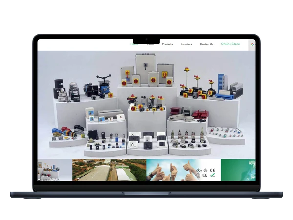
Salzer Group’s old website did not work well on phones, and that cost the company distributor and OEM enquiries. We rebuilt the corporate site mobile-first across 20+ pages, with a product catalogue that buyers can filter on any screen.
Together with our SEO work, the new site helped Salzer triple its organic traffic. We took the same approach for Kaycee Industries, whose desktop-only site broke on phones — we rebuilt the layout and tested it on real devices before launch.
We plan for small screens from day one, so nothing gets squeezed in at the end.
We study your audience, the devices they use and your competitors, then plan content and features for each screen.
You get: device & content planWe design the phone layout first, then expand it for tablet, laptop and desktop, and refine it with your feedback.
You get: approved designsWe code flexible grids, media queries and optimised images, and keep each page light and fast.
You get: staging websiteWe test on real phones, tablets and browsers, fix every issue, then launch and submit your sitemap to Google.
You get: live website

We have built 1000+ websites and apps for businesses in India and abroad.

We design for the smallest screen first, so the most important content always comes first.

Clean code, fast pages, schema and sitemaps help your site perform in mobile search.

Our AMC plans cover updates, backups, security and content changes after launch.
Tell us about your website. We review it on real devices and reply within one business day with a plan and a fixed quote.

